Flexbox: Building a navigation bar (Part 2/2)
- Introduction
- Sample project
- Implementing a responsive design
- Get the source code
- CSS details
- CSS Grid
Introduction #
This is a second article on 2 part series. In this article you will learn how to build a simple example responsive navigation design using Flexbox and media queries.
The first article called Flexbox: Getting Started (Part 1/2) shares fun places to learn Flexbox from.
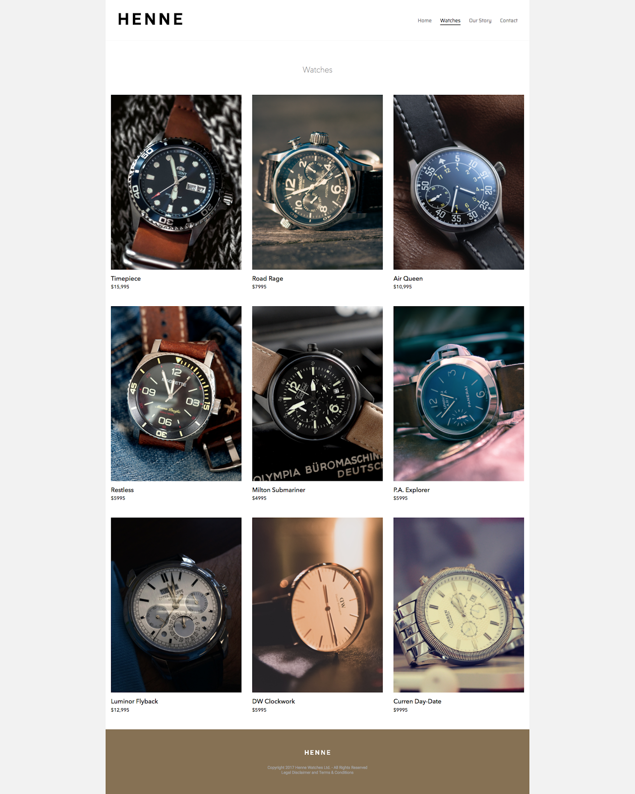
Sample project #
This is the webpage I created and I have used Flexbox on the header. I have also used CSS Grid on the watch gallery. If you read further I explain why I chose to use CSS Grid in addition to Flexbox (instead of relying on Flexbox alone).
Implementing a responsive design #
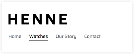
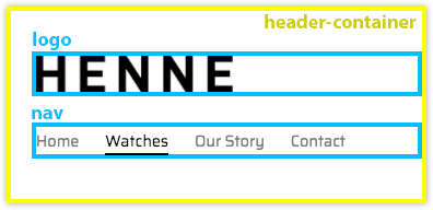
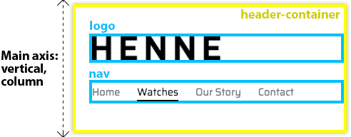
This is what the header looks like on a screen width smaller than 600px. The logo is above the navigation.
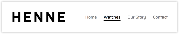
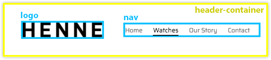
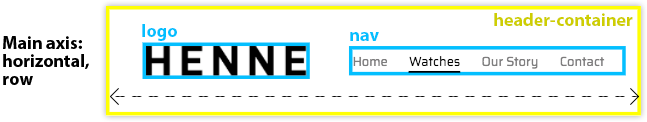
The same header looks like this on on a screen width 600px and larger. The logo and navigation are beside each other, centered vertically.
Get the source code #
You can download the source code for the HTML and CSS for this project here.
Let’s look at the CSS Box model and HTML first.
- I have a main container called
header-container,which I surrounded in a yellow border in the images below (so you can see what it contains). - It includes 2 containers (both of which have blue borders below):
logonav. Inside of thenav, there is the common unordered list with the navigation page names.
This is what the code looks like.
<header class="header-container">
  <div class="logo">
    <a href="index.html" title="Henne home page">
      <img src="images/logo.png" width="180"
    /></a>
  </div>
  <nav>
    <ul>
      <li><a title="Home">Home</a></li>
      <li><a class="active" title="Watches">Watches</a></li>
      <li><a title="Our Story">Our Story</a></li>
      <li><a title="Contact">Contact</a></li>
    </ul>
  </nav>
</header>
CSS details #
Because I have two layouts, I used a media query to create a breakpoint and change the CSS styling.
Screen width smaller than 600px #
If the screen width is between 0px and 599px, the following CSS is applied.
.header-container {
  display: flex;
  flex-direction: column;
  border-bottom: 1px solid #f2f2f2;
  padding: 2.3em 0;
}

.logo {
  margin-left: 5%;
}

.logo img {
  display: block;
}

nav {
  margin: 1.5em 0 0 5%;
}

/*
   More info on block, inline-block, inline
   https://www.w3schools.com/css/css_inline-block.asp
   */
header ul li {
  display: inline;
  padding: 0 1.4em 0 0;
  font-size: 0.9em;
}

header ul li a {
  text-decoration: none;
  color: #7d7c7d;
}

li a.active {
  color: #000000;
  border-bottom: 2px solid #000000;
  font-weight: 300;
}

li a:hover {
  color: #b6b6b6;
}
Notes on the code #
- There is a
header-container, which is a flex container.- The browser knows that it’s a flex container, because it’s
displayis set toflex. flex-directionis set tocolumn(), which meansmain-axisisvertical()cross-axisishorizontal()
- The browser knows that it’s a flex container, because it’s
- Then there is a bunch of extra styling below that, which is not Flexbox.
Screen width larger than 600px #
The following code snippet declares a media query, when the screen is 600px or larger.
@media screen and (min-width: 600px) {
  .header-container {
    flex-direction: row;
    justify-content: space-between;
  }

  .logo {
    margin-left: 2.3em;
  }

  nav {
    align-self: center;
    margin: 0 0.8em 0 0;
  }
}
You’ll notice that on header-container I haven’t declared display: flex; and that’s
because the way I set up the media query. The previous styles still apply and I am
overwriting the lines of code that I want changed.
I have changed the flex-direction to row. Which means that the main-axis is now
horizontal.
Also added justify-content property with a value of space-between. This makes sure the
logo and nav containers are on the opposite ends of the header-container.
I used align-self on the nav, which is a flex item. align-self is a flex item
property and it centers the cross-axis. Which in my case is the vertical alignment,
because my main axis is horizontal (flex-direction: row;). In other words, vertically
centers the items.
Things to note #
-
If you add an image to HTML, it includes a tiny bit of space on the bottom of it. In order to remove it, use
displayproperty and set its value toblock. I used it onlogo imgand also onwatch-image. -
I could have used Flexbox on the
navbut I would have ended up with 2 extra lines of code, so I decided not to. If you want to use Flexbox, it will look like this:
header ul {
  display: flex;
  flex-flow: row wrap;
  list-style-type: none;
}

header ul li {
  padding: 0 1.4em 0 0;
  font-size: 0.9em;
}
Instead I used display: inline;. inline places all the nav titles beside each other,
no need to use Flexbox. By default HTML would have placed nav titles below one another.
header ul li {
  display: inline;
  padding: 0 1.4em 0 0;
  font-size: 0.9em;
}
Add this for Chrome #
If you want the media queries to show up properly in Chrome, add this meta-data tag to
the head element of your HTML document. If you don’t do this, then your HTML will not be
responsive on the most popular browser in the world!
<!-- https://css-tricks.com/snippets/html/responsive-meta-tag/ -->
<meta name="viewport" content="width=device-width" />
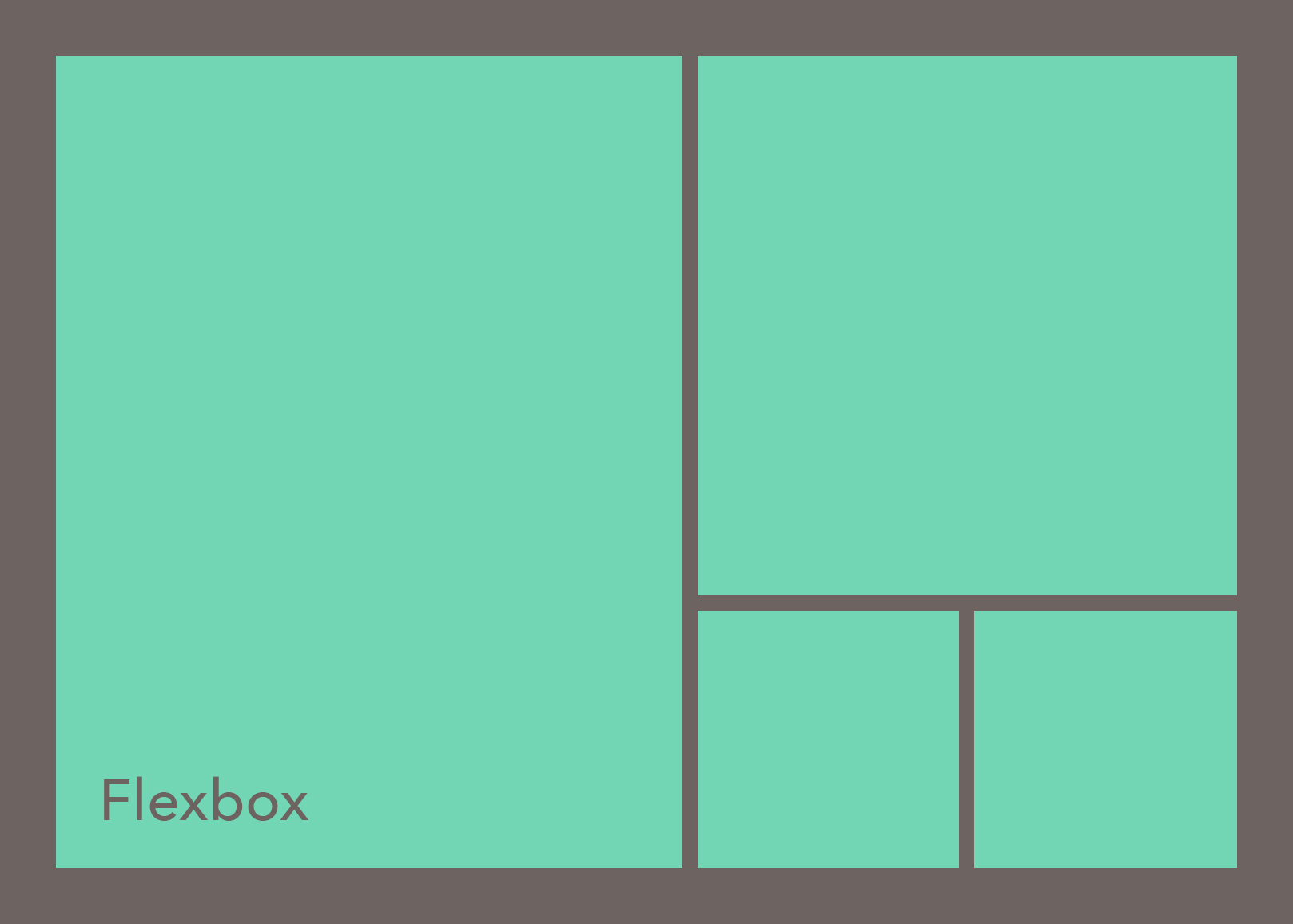
CSS Grid #
Originally I wanted to create the image gallery using Flexbox. I struggled with it for a while but I couldn’t get the watches in watch-grid to align left, while having the same amount of space between them. I also went through other people’s examples, but none of them worked for this case without hacks. So I ended up using CSS Grid.
If you look at the CSS styles (they are all on
Github), you will see that the display
is set to grid and that tells the browser that it’s dealing with a grid. You will also
find new property names like grid-template-columns and grid-template-rows.
.watch-grid {
  display: grid;
  grid-template-columns: 50% 50%;
  grid-template-rows: auto;
  margin-top: 30px;
  justify-content: center;
}
CSS Grid shares some of the same property names with Flexbox, like justify-content for
example, so it’s pretty simple to get started with the CSS Grid. I learnt it from
“CSS Grid First Look”
from Lynda.com. If you are interested in, check out this
awesome video by Morten Rand-Hendriksen first.
-
About CSS Grid and Chrome. I used percentages (
%) instead of fractions (fr) because Chrome doesn’t display them correctly with fractions. I am not sure why, but if you know why, please let me know. -
If you want to see how all of the CSS Grid code looks like, check it out at Github.
👀 Watch Rust 🦀 live coding videos on our YouTube Channel.
📦 Install our useful Rust command line apps usingcargo install r3bl-cmdr(they are from the r3bl-open-core project):
- 🐱
giti: run interactive git commands with confidence in your terminal- 🦜
edi: edit Markdown with style in your terminalgiti in action
edi in action