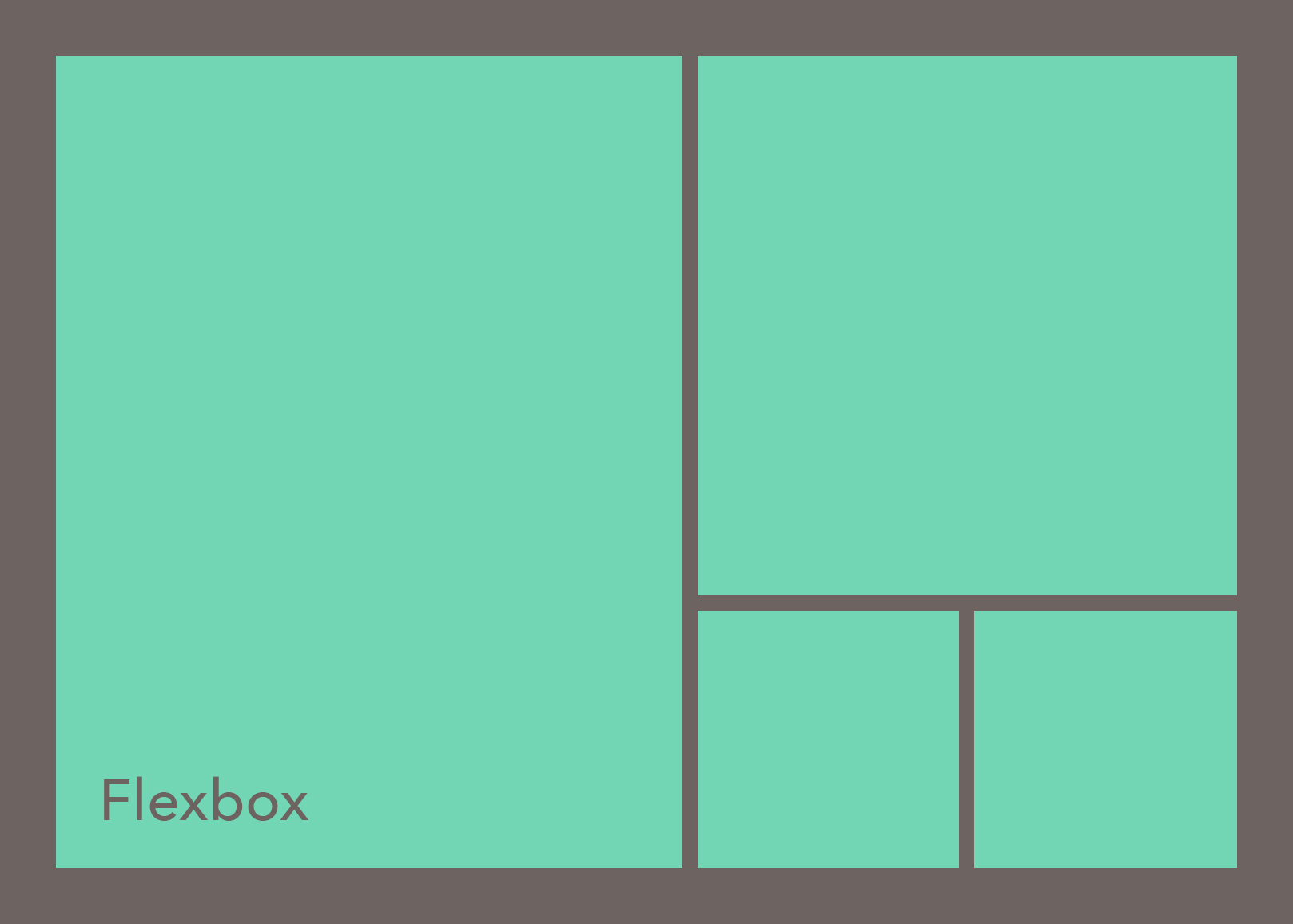
Flexbox: Getting started (Part 1/2)
Introduction #
The goal of this series of articles is to help you to learn Flexbox in a fun interactive way and then help you to build simple real life examples using Flexbox.
-
In this first article you will find great resources to get started with Flexbox.
-
In the second article you will learn how to build a simple example responsive navigation design using Flexbox and media queries.
In order to benefit the most of this content, you need to have a basic understanding of HTML and CSS. If you have this, keep reading.
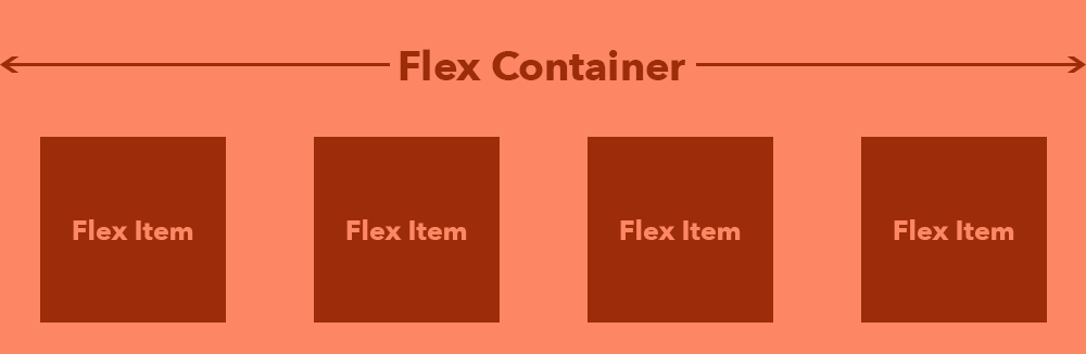
About Flexbox #
Flexbox is a CSS layout mode which makes it easier to create responsive websites. It allows us to effortlessly manipulate the child elements (also called flex items) of a flex container. For example, you can:
-
Reorder the flex items.
-
Easily place items in a row beside each other and then by adjusting the browser window, the space between them will also adjust.
-
Make those items wrap to the next line (inside the container) when screen gets smaller etc.
Flexbox is not the solution to everything by itself. It’s like a team player in a great soccer game. Every player is valuable, but they all play a different role. If one player has to play for 2 positions, the team is compromised. The same applies to building. If you try to use Flexbox for everything (and end up nesting it a lot) the page will be compromised, and will be harder to manage. While you can get away with that, there are tools out there that will help you to make this process easier (such as CSS Grid).
Terminology #
Lynda.com is a good resource for learning front-end development, including Flexbox. Because Flexbox is quite simple to understand, I don’t think it is necessary to take an online course. You will be able to capture it faster by reading and understanding the basics. Then jump straight into the code and learn by practicing.
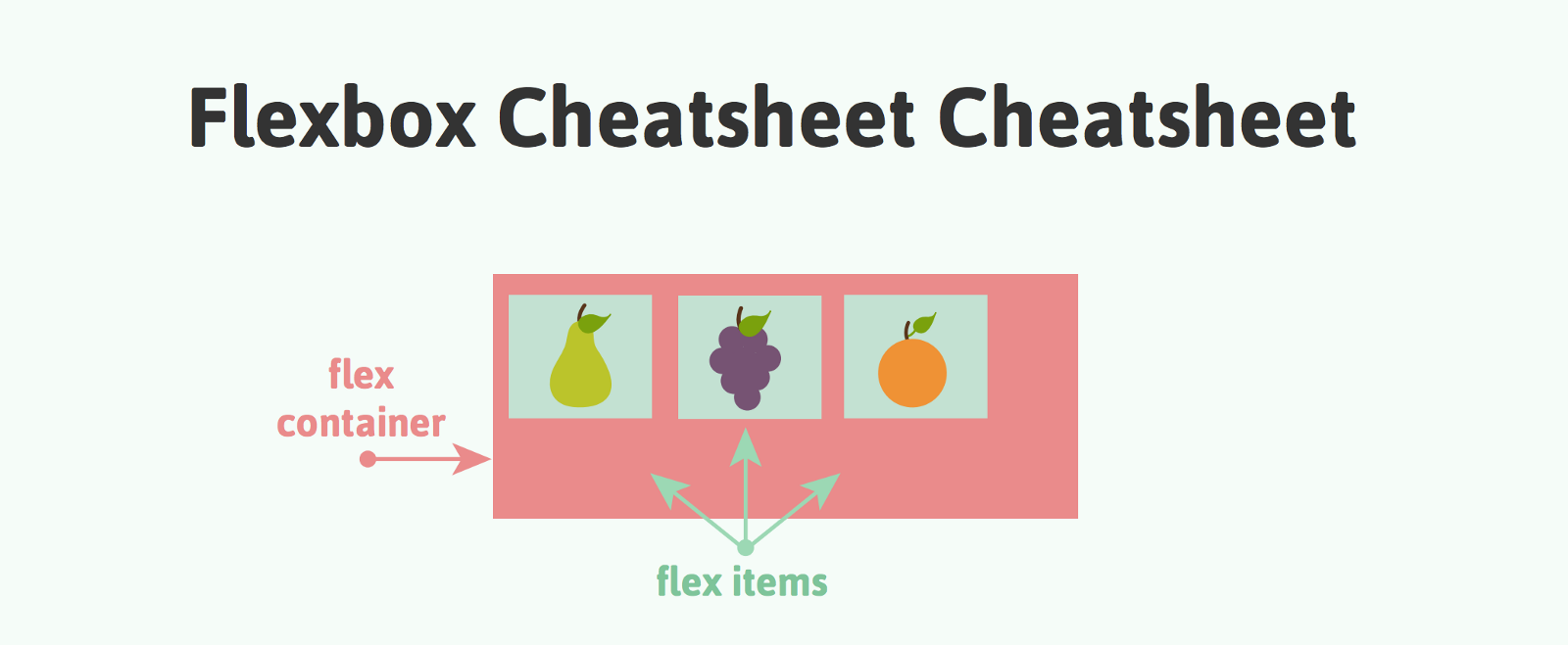
Image by Joni Bologna
-
Here’s a cheat sheet by Joni Bologna aka Joni Trythall. She wrote and illustrated children’s books as a hobby and you can see that design in her cheat sheet. It’s fun and simple.
-
If you want something more sophisticated or just double down on your knowledge, check out The Ultimate Flexbox Cheat Sheet by Sean Fioritto. You will also find snippets of code which work in all browsers.
-
To understand Flex items and how they behave, check out Chris Wright’s Flexbox Adventures.
Practice by Playing #
Flexbox Froggy #
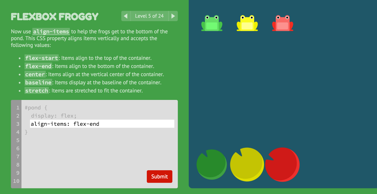
With Flexbox Froggy you can play a game and learn the terminology at the same time.
It was created by Thomas Park, researcher at Drexel University. He is one of the collaborators of openHTML, a collaborative research project aimed at designing better tools and practices for learning web development.
Flexbox Playground #
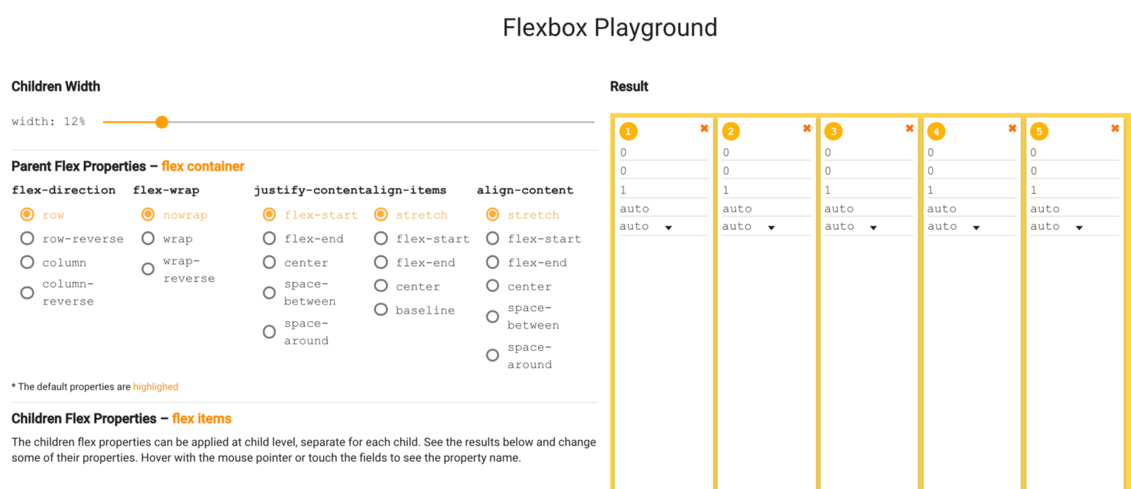
Have fun on the Flexbox Playground to see what will happen when you will play with flex container and flex item properties. It was created by Dimitar Stojanov, founder of Invoicebus.
Summary #
I hope you will have fun while learning Flexbox.
In the next article, called Flexbox: Building a navigation bar (Part 2/2) you will learn a one way how to build a simple navigation using Flexbox and media queries.
👀 Watch Rust 🦀 live coding videos on our YouTube Channel.
📦 Install our useful Rust command line apps usingcargo install r3bl-cmdr(they are from the r3bl-open-core project):
- 🐱
giti: run interactive git commands with confidence in your terminal- 🦜
edi: edit Markdown with style in your terminalgiti in action
edi in action