A pragmatic guide to designing and building responsive web applications
- Introduction
- What are responsive web applications?
- Why should we care about making responsive apps?
- How to design and build a responsive application
- Things to keep in mind when making responsive web apps
- Viewport size vs screen/display size
- The confusion with using words like a mobile, tablet and desktop size
- Wrap up
- Useful links
Introduction #
This article is for developers and designers who want to learn how to build responsive web applications. I’ve been a product designer for more than 6 years, working at my startup and also at several other startups in the San Francisco Bay Area.
As a designer, while I was working with developers and launching several products, I became more curious about how they build the apps that I was designing. 🤔 My curiosity led me to switch roles and become a front end web developer. Two years into this journey I am now building web applications (in addition to designing them).
Everything I design and build is responsive and in this article I will show you how I do it.
What are responsive web applications? #
Responsive web applications are about usability. These web applications are usable in any browser viewport size (I discuss browser viewports in more detail at the end of this article).
Let’s say a user opens a web application in a web browser and resizes the browser viewport size to be the smallest width, then, resizes the browser window the largest width.
If this user can do what the app is intended to do when the viewport is the smallest size,the largest size, and all the sizes between those two (without zooming in and out of the application), only then is the web application responsive.
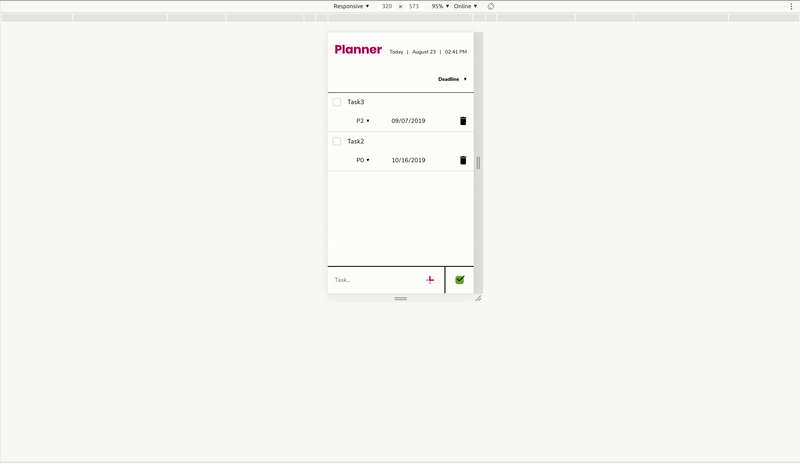
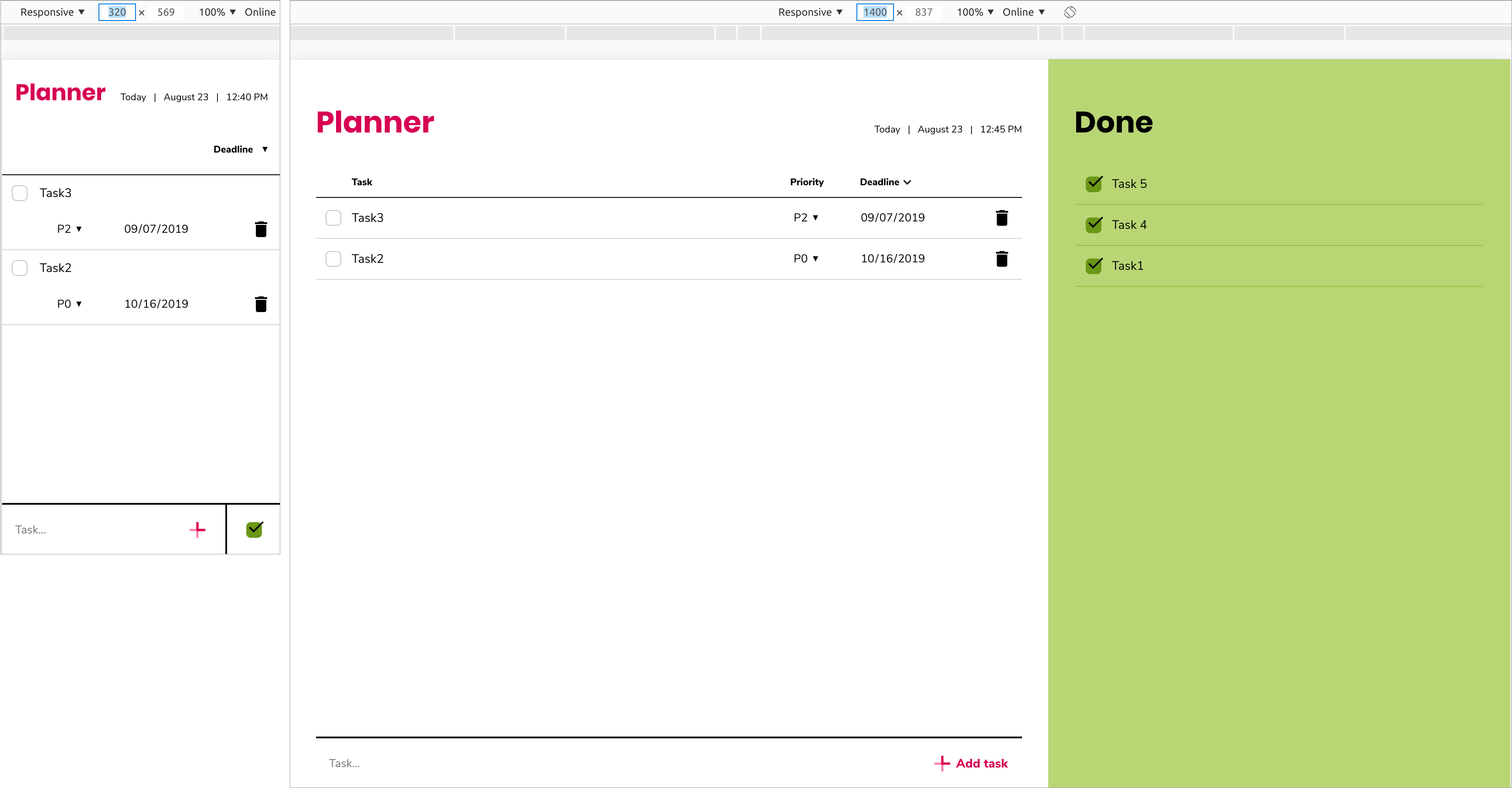
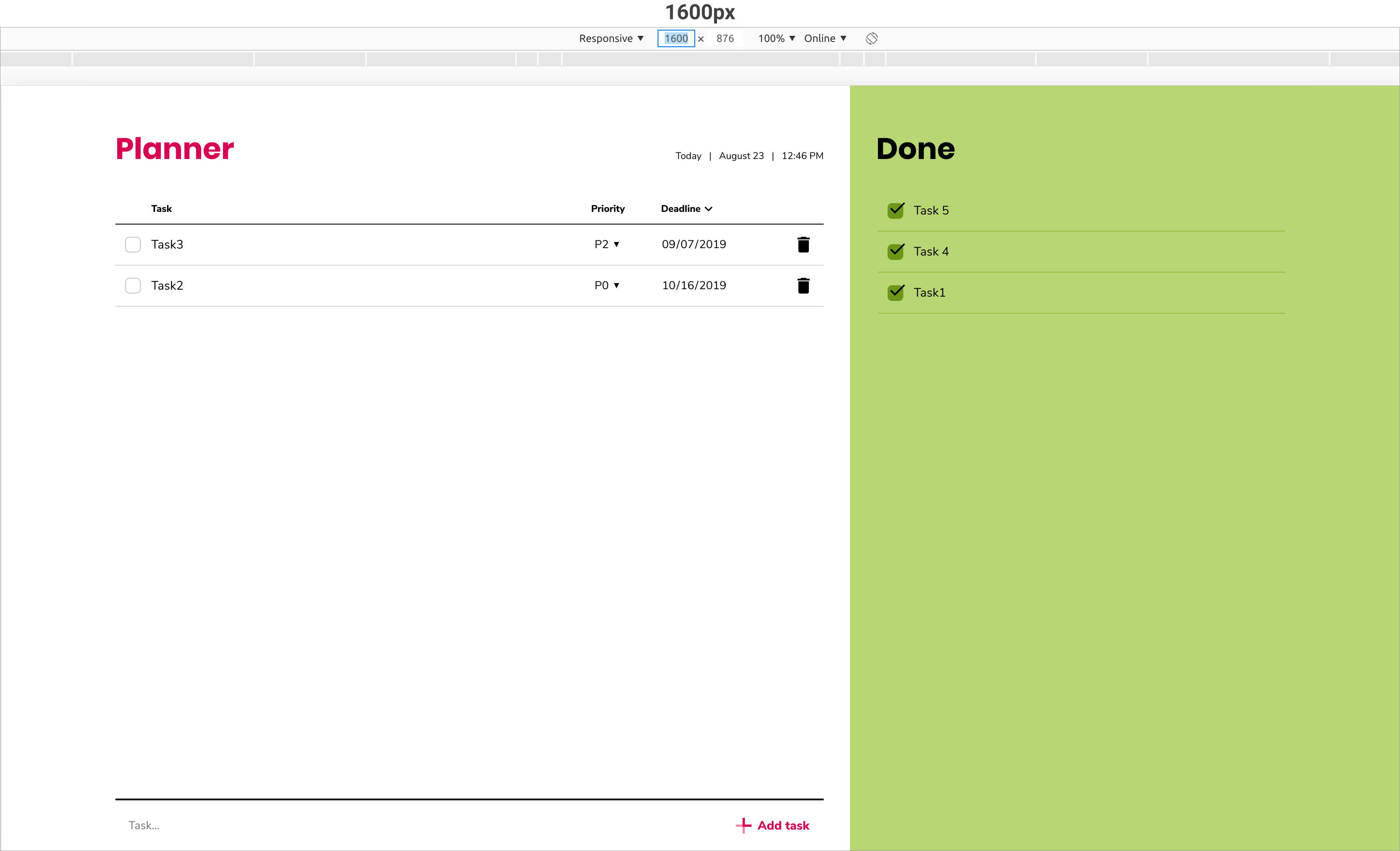
While explaining the process of designing and building a responsive web application, I am using one of the apps I’ve built as an example. The web app is called Planner and it’s a to-do list app that allows to organize and track tasks that need to be done.
Why should we care about making responsive apps? #
The main reason is global smartphone adoption. If your application is intended to be used in a smartphone web browser, then it needs to be responsive. If the user opens your non-responsive web application and the content is zoomed out / looks tiny, then the user will have a poor experience in your application (pinching or zooming in and out in an attempt to use it). If you design your app well and make it responsive, your users will have a better experience, which may help you and the company you work for achieve the revenue and/or engagement that you are after.
How to design and build a responsive application #
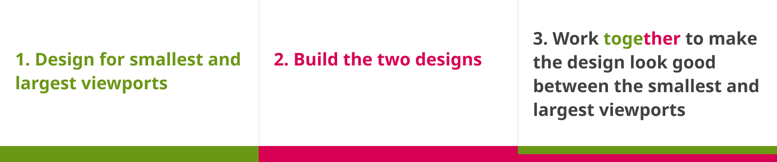
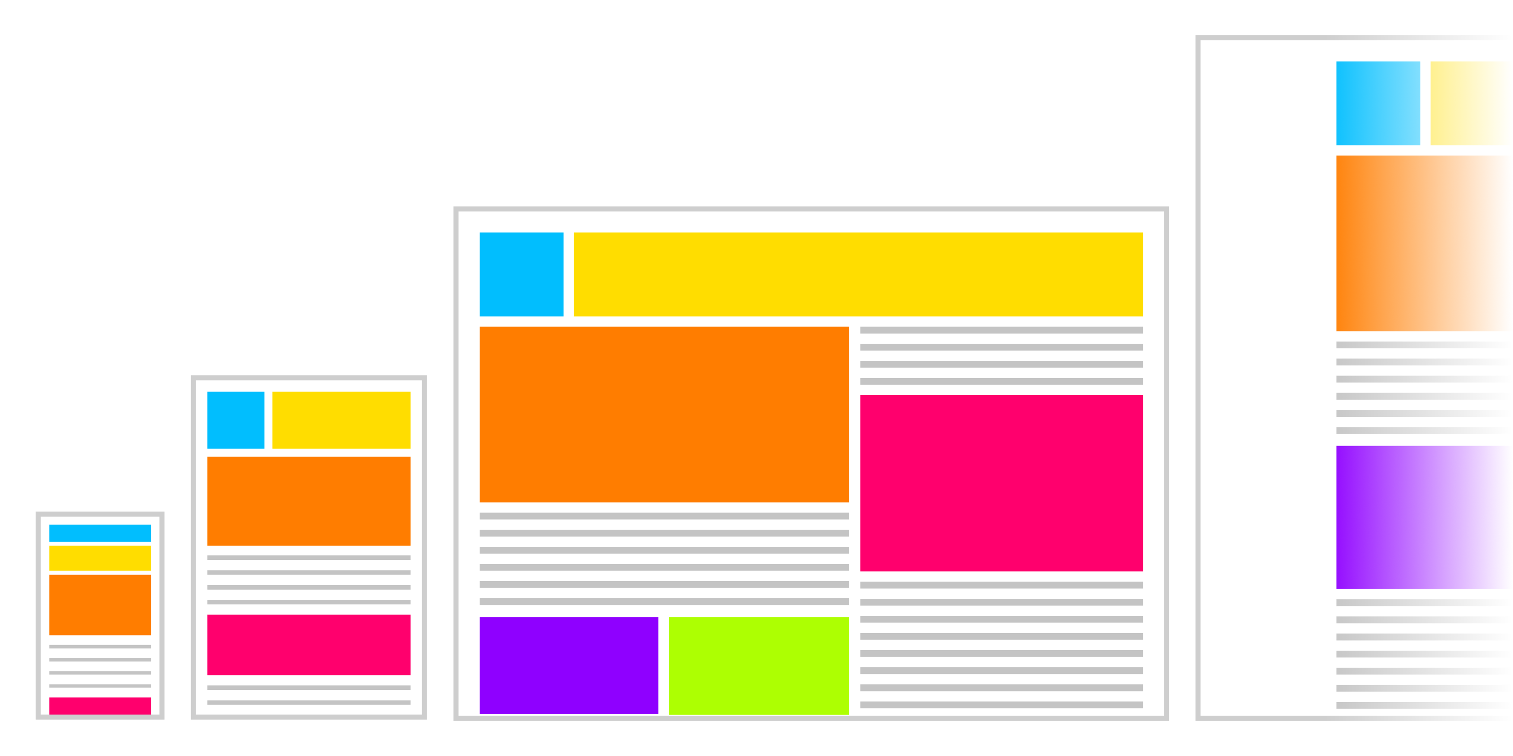
1. Design for smallest and largest viewports #
The designer should choose the smallest and largest viewport sizes to design for. I generally design for 320px as the smallest viewport width and the largest viewport width depends on the nature of the app. I do that because all modern smartphone screen widths are larger than 320px. Here’s a pro tip: I mostly design in Figma now, so while I’m designing the app, I always open up the design in Figma Mirror App on my phone to check if all the clickable areas are large enough, text is readable etc.
In the Planner app example below you can see the designs I created for 320px viewport and larger than 1400px viewport:
2. Build the two designs #
First, build the small design. Then add a CSS media query breakpoint between those two states (small and large). At this stage, you don’t know when to add the breakpoint and that’s ok. Finally, build out the large design.
The exact breakpoint(s) will be decided later on when working with the designer. The most important thing in this stage is to make the design fluid, so it’s possible to resize the viewport size and see how the design looks like in a larger/smaller viewport.
Here are some suggestions:
- Use
%when sizing thewidthandheightof the container. - Use
max-width: 100%with images. - Use CSS Flexbox, Bootstrap and/or CSS Grid if it makes development easier.
When your app is fluid, you and the designer can figure out what happens between those two states.
3. Work together to make the design look good between the smallest and largest viewports #
Now that you have a fluid app, open it in your browser’s developer tools, with both you and the designer looking at this together.
Set the width of the viewport to the smallest size that the designer chose in their design, and slowly start resizing the viewport, stretching it larger.
The designer will decide when exactly the design starts to “look odd” and can be improved. That is where you (the developer) add a breakpoint.
Now the designer will most likely want to make some changes. If the changes are small, you can do it in the code right there in the browser’s developer tools. If the designer is not sure exactly how the design should look or it will take more time, she/he can write down the size of the viewport in pixels and design a static artboard in their chosen design tool for that size.
Whenever this design is done, you can implement it, and repeat this viewport resizing process w/ the designer until you get to the largest viewport.
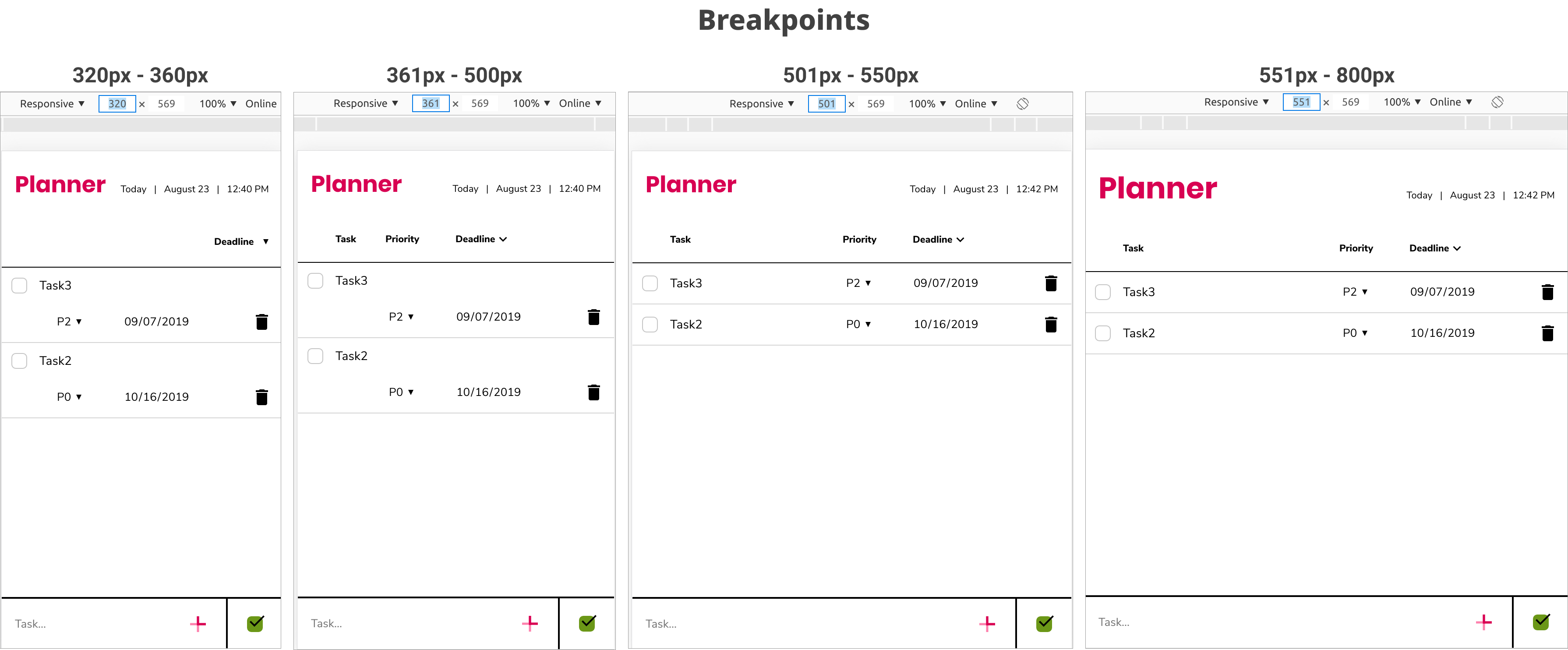
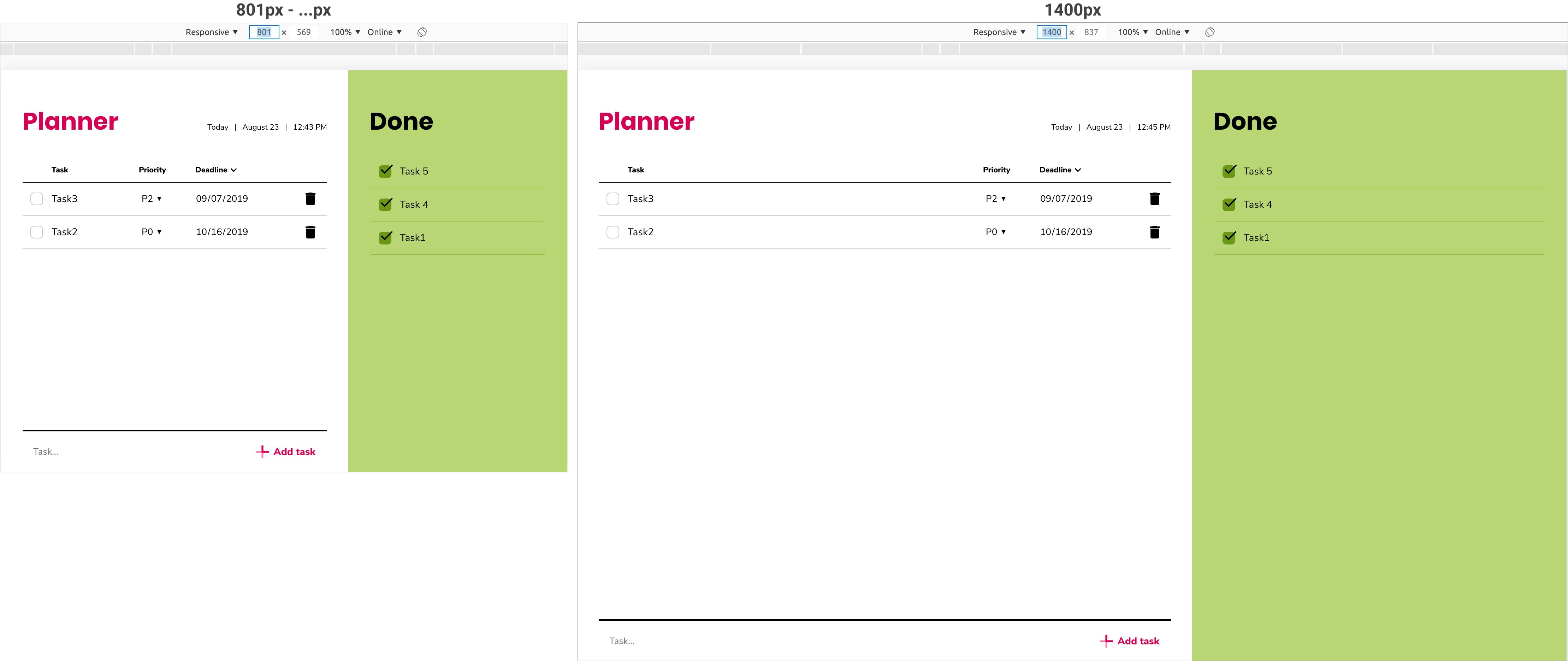
Here are all the breakpoints I created for Planner:
Things to keep in mind when making responsive web apps #
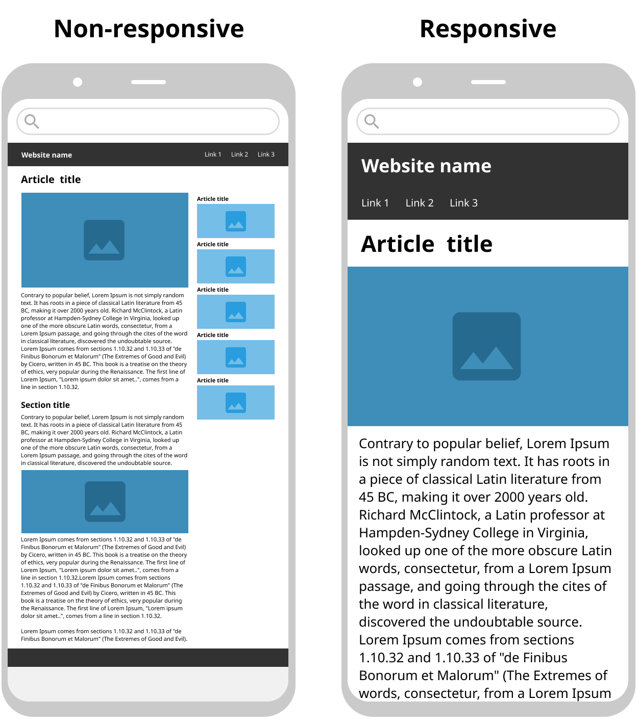
- Is the most important content visible? For example: if the heading text is too large and takes too much space, and hides the content, make it smaller. Another example: is your navigation bar too large for the smallest viewport taking up too much valuable space?
- Is the call to action button visible and noticeable?
- Is the text size readable?
- Are the clickable areas of your application large enough when opened up on a browser in a smartphone?
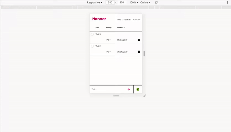
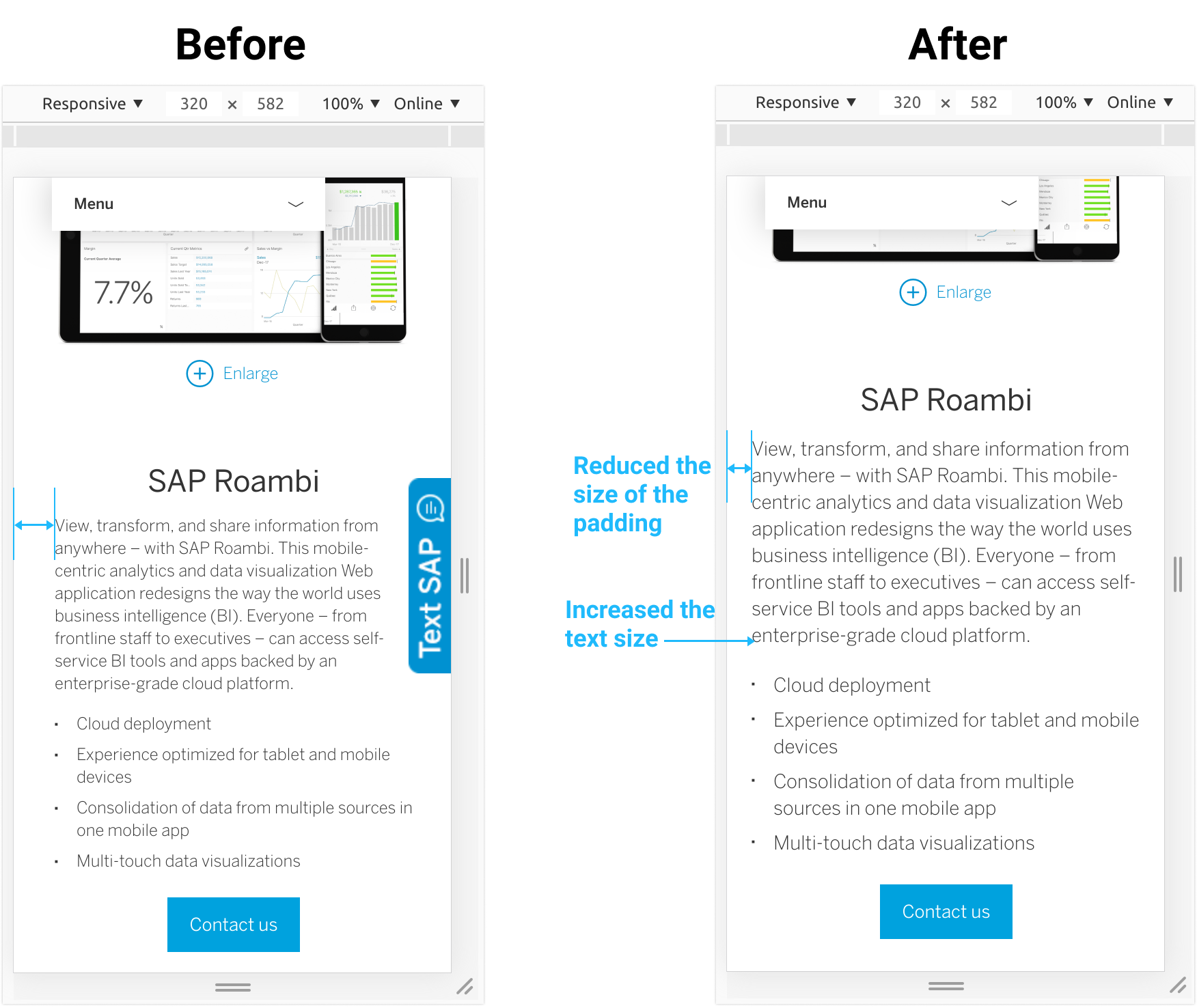
- Could you be using less padding/margin on your small viewport design to allow more space for content? Example below:
Viewport size vs screen/display size #
When I use the term “viewport”, I’m intentionally avoiding words like “screen size” or “display size”. Screen and display sizes are set by device manufacturers. You can not change the size of the screen/display on your device. Your browser’s viewport size, on the other hand, is fluid. In a desktop/laptop browser, you can make the viewport as large as your physical device’s screen size, or as small as ~ 510px in width in Chrome. In Chrome developer tools you can make a viewport as small as 50px.
The confusion with using words like a mobile, tablet and desktop size #
Designers create mockups in a static / rigid (not fluid) environment like Sketch, Figma, Adobe XD. This can result in designers finding it difficult to fully grasp the concept of responsive design. Their job is to create fluid designs, but the tools are rigid. Designers don’t know how many different size Sketch artboards or Figma frames they need to design. Then concepts like mobile size, tablet size, and desktop size come to play as rough guidelines.
For designers, I would suggest that instead of mobile, tablet and desktop size, use words like “smallest viewport size” and “large viewport size”. From there figure out the in-between viewport sizes with your developer(s). For example, if you say the following to a developer: “this is a tablet size design which has a width of 600px” she/he doesn’t understand why are you calling it “tablet size”, because they can just resize their browser’s viewport to 600px in their desktop / laptop (which is obviously not a tablet).
Wrap up #
Web apps always live in a browser. They aren’t native apps. You can open them up in your desktop and laptop browser, and you can also open them up in your mobile and tablet browser. This flexibility is one of the reasons I love designing and building for the web.
Useful links #
P.S. Big thanks to Nazmul Idris (Software Engineer at Google) for his help in editing this article.
👀 Watch Rust 🦀 live coding videos on our YouTube Channel.
📦 Install our useful Rust command line apps usingcargo install r3bl-cmdr(they are from the r3bl-open-core project):
- 🐱
giti: run interactive git commands with confidence in your terminal- 🦜
edi: edit Markdown with style in your terminalgiti in action
edi in action