Designing for multiple screen densities on Android
👀 Watch Rust 🦀 live coding videos on our YouTube Channel.
- Density
- Density matters
- Images — Vector vs Bitmap
- Logical Density Buckets
- PPI vs DPI
- Density-Independent-Pixels (DP or DIP)
- Width and height in DP
- Designing for 1x vs other densities
There were over 24,000 different types of devices running the Android OS in 2015, and this number has grown since then 😲. There are over 2B devices on the market according to Google.
Many companies like Samsung, Lenovo, Huawei, LG, and Google make phones, tablets, and laptops that run on the Android operating system. All these devices have different screen densities, sizes, resolutions, and aspect ratios.
In this article, I am going to do a deep dive into Android screen density and provide some guidance on how to design for such a huge diversity of screen densities. Having a firm grasp of this is critical in being able to create wireframes and designs in Sketch that can be implemented on actual devices (phones, tablets, laptops, TVs, wearables).
We are only going to look at phone screen densities, but the same concepts apply to tablets, TVs, and wearables running the Android OS.
Density #
Density refers to how many pixels have been physically squeezed into a 1 inch x 1 inch area. In digital displays / screens like monitors, phones, and tablets, density measurement unit is PPI **(pixels-per-inch). For print (posters, magazines, and books) the unit of measurement is **DPI (dots-per-inch). However, in Android, PPI and DPI are used interchangeably, and the APIs and docs refer to density in DPI (not PPI).
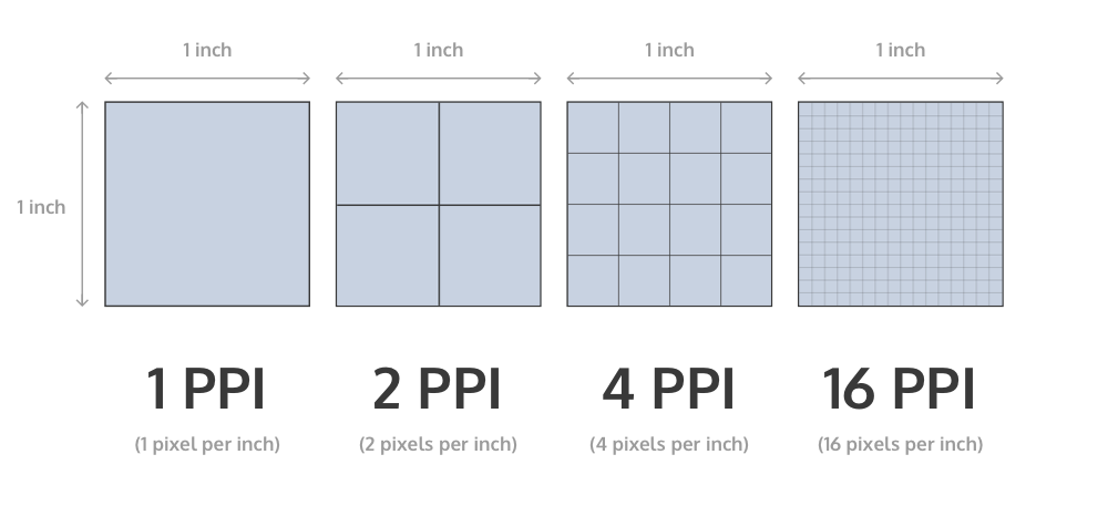
If a screen has n PPI (or DPI) density then it means it contains that n pixels in a row and n pixels a column, for a 1 inch x 1 inch size of that screen.
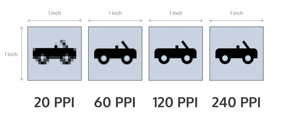
The image above has 4 different densities: 20 PPI, 60 PPI, 120 PPI and 240 PPI. It’s easy to see that the more pixels per inch, the sharper the image 👍.
Density matters #
It is important to understand how density works in order to to be able to:
- Design your wireframes in 1x density in Sketch to make your life (and your developer’s life 😀) easier.
- Export bitmap images (icons, photos) in 5 different sizes. This ensures that they appear as sharp as possible devices with different screen densities. And to ensure that memory and CPU is used efficiently on phones (especially low-end hardware).
Images — Vector vs Bitmap #
Bitmap images are often used for app icons, notification icons, backgrounds of components in the app, etc. This means that if you want to use bitmaps in your designs (which are going to be displayed on phone screens of various densities) that you would try and provide the highest resolution bitmap possible right? Unfortunately, it is not that simple. 😔
Ideally, you would want to create assets as SVGs in Sketch, and that will ensure that they are “density independent”. Unlike bitmap images, SVGs can “scale” to fit any size screen of any density.
- SVGs files actually contain a set of instructions that tell Android how to accurately paint an image on a screen of any size or density.
- Bitmaps are “fixed” size and resolution, meaning that the number of pixels are fixed in every bitmap.
If you create vector graphics assets in Sketch this means that the developer will be able to take them and use Android Studio to generate vector drawables (in XML) that they can use in their code. Vector graphics can scale to any size without losing image sharpness and they tend to be very compact in size as well.
Let’s say you have a 100x100 px bitmap. This image will appear much smaller on a high-density screen than on a low-density screen. SVG images, on the other hand, will look “right” no matter what the screen size / density. Bitmaps lose quality when you upsample them, but they don’t when you downsample them.
If you provided bitmap assets in the highest resolution, then the Android device would have to do a lot of work to downsample or upsample it and make it look “right” on whatever screen size the app is running on. This can lead to apps that consume more network, CPU, and memory than they should, and this results in a poor UX for the user (and has a negative impact on battery life).
In order to understand what these 5 different sizes in which you need to export your images are, and to understand what is a 1x density screen is, we need to first look at “logical density buckets” that have been created for Android.
Logical Density Buckets #
Logical density buckets are created by Android to help you and me to stay sane while exporting images 😛. As I mentioned at the start of this article, many companies use Android OS to make phones. These phones screens have different physical sizes, densities, aspect ratios and resolutions. If you had to export images to match each screen size exactly, then you would have to export a ridiculous number of versions of each asset. Also, the multitude of those assets would increase the size of the app’s APK.
What Android team did is that they looked at the different screens available and created 6 logical density buckets to group the different screen densities. I am going to show you only 5, because 1 one of them, the low-density bucket (~120 DPI) is not very common anymore.
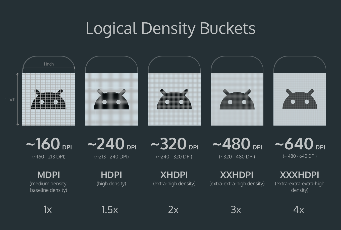
There are 5 different buckets:
- Medium density bucket = ~160 DPI = 1x or 100%
- High density bucket = ~240 DPI = 1.5x or 150%
- Extra-high density bucket = ~320 DPI = 2x or 200%
- Extra-extra-high density bucket = ~480 DPI = 3x or 300%
- Extra-extra-extra-high density bucket = ~640 DPI = 4x or 400%
Medium density bucket is the baseline density, the 1x density, and all the other densities are calculated using it’s ~160 DPI as a baseline.
For example, if a device has a 577 DPI screen, then it would belong to XXXHDPI bucket, which is ~640 DPI. Which means when your bitmap asset is rendered in 577 DPI screen, it will be scaled down a little bit to 577 DPI from 640 DPI exported asset. Again, this doesn’t apply to vector graphics.
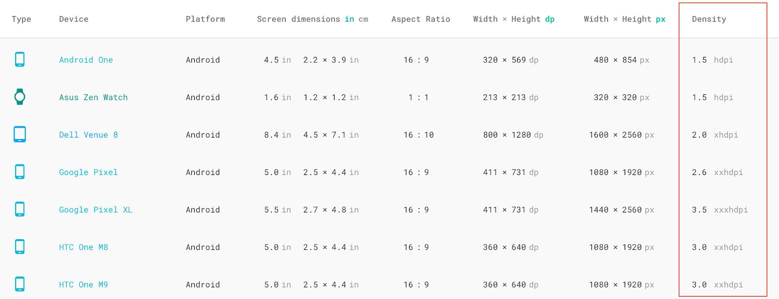
Currently, the best place where you can go to find out the screen density is Material Design device metrics website. Check out the last column for density. This website should have most of the devices, but definitely has some important ones missing like Pixel 2 and Pixel 2XL.
Note: If you design 1x, you need to know the density of your phone screen to understand how much you need to scale your design up in Sketch Preview plugin to see a sharp image on your Skala app on your Android phone.
PPI vs DPI #
I used PPI (pixels-per-inch) earlier in this article, but Android uses DPI (dots-per-inch), to describe logical density buckets. This might be confusing, and I’m not really sure why the Android team chose to use DPI instead of PPI. Because Android uses DPI, then we end up with names like MDPI, HDPI, XHDPI, XXHDPI, and XXXHDPI, rather than MPPI, HPPI, XHPPI, XXHPPI and XXXHPPI 😄.
Density-Independent-Pixels (DP or DIP) #
Density-independent-pixels also known as device-independent-pixels help to keep UI elements the same physical size across the different density devices while maintaining the element’s sharpness. The denser the screen, the more pixels are required to keep the same physical size. DPs are only used in Android. In iOS, you need to use Points.
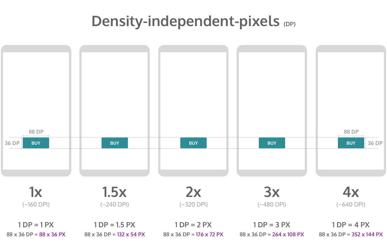
If you look at the image above, all of the “buy” buttons appear the same physical size in different density screens. Even though the amount of DPs (88 x 36 DP) stays the same on all screens, the amount of pixels it takes to fill that space on each screen increases according to each screen density.
- In 1x screen (~160 DPI) 88 x 36 pixels button is equivalent to 88 x 36 density-independent-pixels, because 160 DPI is a baseline density where 1 DP = 1 PX.
- In 1.5x screen (~240 DPI) it takes 1.5 times as many pixels (132 x 54 PX) to fill the area of 88 x 36 density-independent-pixels.
- In 2x screen (~320 DPI) it takes twice as many pixels (176 x 72 PX) to fill the area of 88 x 36 density-independent-pixels.
- In 3x screen (~480 DPI) it takes three times as many pixels (264 x 108 PX) to fill the area of 88 x 36 density-independent-pixels.
- In 4x screen (~640 DPI) it takes four times as many pixels (352 x 144 PX) to fill the area of 88 x 36 density-independent-pixels.
If you are using bitmaps, rather than vectors, then you need to export each bitmap in all sizes (1x, 1.5x, 2x, 3x, 4x). If you are using Sketch, then you most likely will have vector graphics and you don’t need to worry about it.
DPs are great if we don’t want to specify in each individual density what the sizes of our UI elements should be. For example, if a button needs to be 88 x 36 PX in 1x design and also 132 x 54 PX in 1.5x design and so on until the 4x design, it’s easier to use DPs and note that button needs to be 88 x 36 DP and this measurement applies to all density screens.
Width and height in DP #
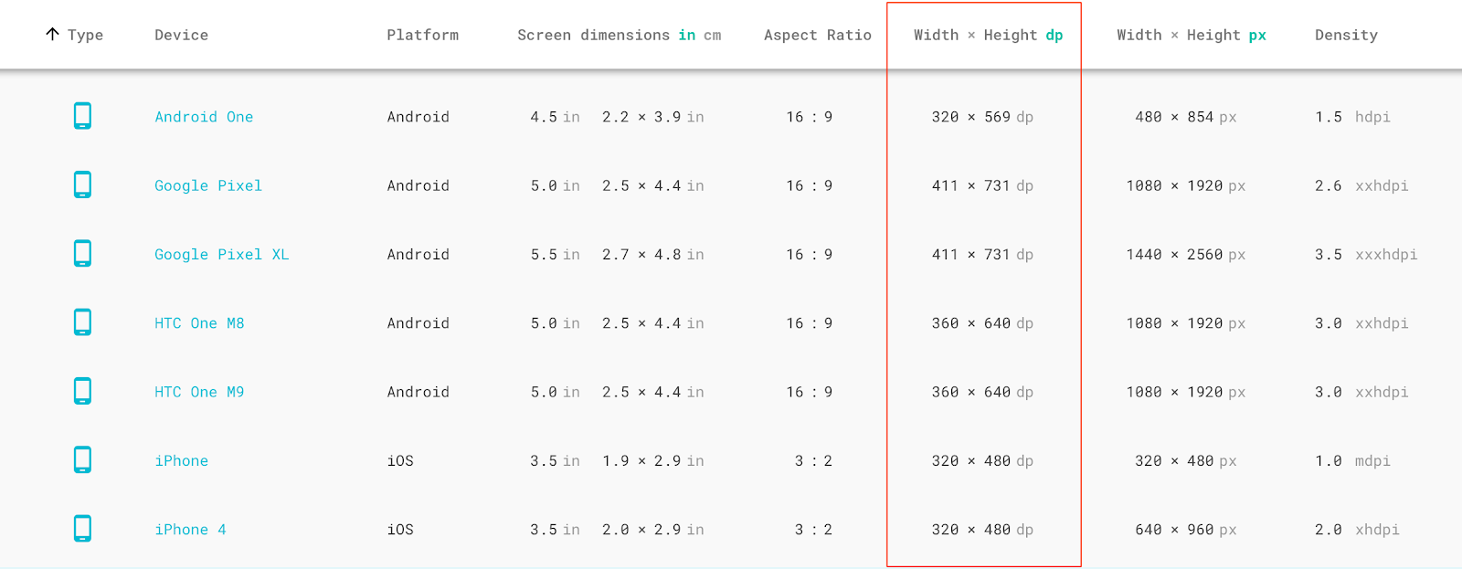
In order to create 1x design, you need to know your test device width and height in DP.
If you are using one of the popular Android phones as your test device, then you will find its width and height in DP from the Material Design device metrics website. Pixel 2’s width and height in dp is 411 x 731 dp, the same as Pixel.
Whatever these numbers are in DP, that is the size your artboard in pixels in Sketch. If you are designing for Pixel, then your artboard size is 411 x 731 px.
If you want to see an example of this, here’s a 1x design I created using Sketch for an Android app called UAMP (Universal Android Music Player). if you download the Sketch file (from the high fidelity mockup section), you will find that the size of each artboard is 411 x 731 px.
Designing for 1x vs other densities #
I recommend that you design in 1x, but you can design for 1.5x, 2x, 3x, 3.5x, or 4x if you choose. The following are some benefits of designing in 1x:
- You can use Material Design guidelines 1 to 1. By that I mean, 8dp in your grid will be 8 pixels in Sketch.
- Your developer will be building the app using DPs. If you design 1x, they don’t have to calculate 1x design measurements from the larger design you created. They can simply take measurements in pixels and the value is the same in DPs in their code. However, if you designed 3.5x, then the developer will have to divide all values by 3.5. Don’t make your developer have to calculate DP values 😃.
P.S. Big thanks to _Nazmul Idris (Software Engineer at Google) for his help in editing this article._
📦 Install our useful Rust command line apps usingcargo install r3bl-cmdr(they are from the r3bl-open-core project):
- 🐱
giti: run interactive git commands with confidence in your terminal- 🦜
edi: edit Markdown with style in your terminalgiti in action
edi in action