Navigation and Styling with React Native
- Introduction
- What you will learn in this tutorial
- Using react-native-elements
- Using react-native-vector-icons
- Styling best practices
- Custom fonts
- Understanding navigation
- React Native resources
- React, Redux, and native Android resources
Introduction #
This tutorial is all about in app navigation in React Native. If you’ve read my getting started with React Native tutorial, you will remember that I used the Navigator class. This is the old way of doing navigation. The new way is much better and more powerful, and it’s called React Navigation. I will cover all the navigators in this tutorial - Drawer Navigator, Stack Navigator, and Tab Navigator. I won’t be covering React Native basics, for that please refer to my Getting Started with React Native tutorial.
What you will learn in this tutorial #
This tutorial will walk you thru the creation of a demo app that works on Android and iOS. We will cover:
-
Best practices around styling your app (how to separate styling parameters / configuration in one place). There are benefits to doing this especially when you are working with designers.
-
Going deep into the aspects of in app navigation using React Navigation (which as of this tutorial is very early in it’s evolution, but is the way to do navigation in React Native moving forwards). It’s a delightful library to use!
-
Using react-native-elements and react-native-vector-icons. These are useful for getting really polished UI elements and font icons into your project quickly.
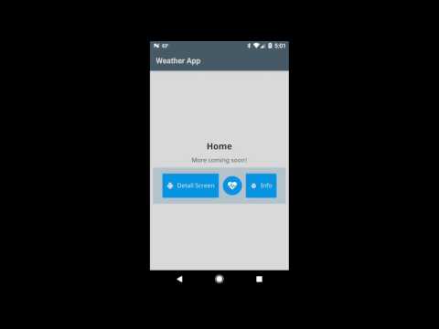
Here’s what the app looks like on Android (it looks similar on iOS):
Get the project from GitHub #
Here’s the GitHub link for this project
-
Once you get the project on your development machine, please make sure to run
npm installin the root folder where you cloned this repo to. -
Then open up the project in your favorite IDE.
-
To run the app, just type
react-native run-androidfrom the command line, in the root folder.
With that out of the way, let’s begin!
Using react-native-elements #
React Native Elements library contains a set of really useful and powerful UI components that you can drop into your app and become productive immediately. That’s one of the biggest promises of React Native, to get you to be more productive than you would in either native Android or iOS.
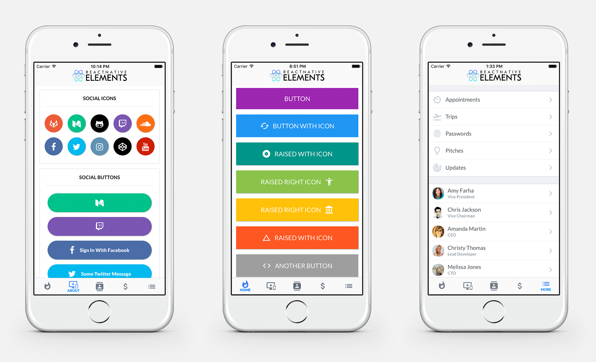
Here are some examples of components you will get from this library:
-
Buttons that you don’t have to style from scratch every time you use them. They work really nicely with Icons (that can use font icons and vector icons).
-
Badges and Avatars that you are used to from Material Design are available as well.
-
Commonly used social media icons and buttons.
-
For a complete list, check this link out.
Here’s an example of how to use the a Button that’s supplied from this library:
<Button
  onPress={() => navigate('DetailsRoute', {param1: msg2})}
  backgroundColor={css.colors.button_bg}
  color={css.colors.button_fg}
  title='Detail Screen'
  fontFamily={css.values.font_body}
  fontsize={css.values.font_body_size}
  icon={{
    name: 'android',
    color: css.colors.button_fg
  }}
  borderRadius={css.values.border_radius}
/>
Here’s an example of using an Icon that loads a font icon from FontAwesome.
ToastAndroid.show('Heart button pressed', 10000)}
  reverse
  name='heartbeat'
  type="font-awesome"
  color={css.colors.button_bg}
Installation #
First, you have to install the react-native-vector icons library, since that is used by
react-native-elements, using this:
npm i react-native-vector-icons --save &&
react-native link react-native-vector-icons
Then, you have to use npm i react-native-elements --save to install the library.
Since the dependency on the react-native-vector-icons requires some fonts to be installed on your
development environment, you have to run the react-native link command. For more information on
loading custom fonts,
check this article out.
Using react-native-vector-icons #
Vector icons have many advantages over bitmap icons:
-
You can apply the tint color and background color to any vector icon asset and colorize it without having to generate multiple bitmap asset variations.
-
You can scale it without any loss of quality on any DPI screen at any size.
-
They consume very little space on device when compared to their bitmap counterparts.
-
Basically, what’s there not to like?
Font icons are awesome as well, since you can just use a characters in a chosen font as icons. The
react-native-vector-icons
package gives you all of these things on a silver platter.
There are a few font icon sets bundled with the library as well:
-
Entypoby Daniel Bruce (411 icons) -
EvilIconsby Alexander Madyankin & Roman Shamin (v1.8.0, 70 icons) -
FontAwesomeby Dave Gandy (v4.7.0, 675 icons) -
Foundationby ZURB, Inc. (v3.0, 283 icons) -
Ioniconsby Ben Sperry (v3.0.0, 859 icons) -
MaterialIconsby Google, Inc. (v3.0.1, 932 icons) -
MaterialCommunityIconsby MaterialDesignIcons.com (v1.7.22, 1722 icons) -
Octiconsby Github, Inc. (v5.0.1, 176 icons) -
Zocialby Sam Collins (v1.0, 100 icons) -
SimpleLineIconsby Sabbir & Contributors (v2.4.1, 189 icons) -
You can browse them all here.
The installation instructions for the react-native-elements above also handles installing the
react-native-vector-icons package.
Styling best practices #
A large part of this project on GitHub is dedicated to styling. Most React Native components take a StyleSheet object (passed in a style attribute) in which you can pass whatever CSS like formatting you like. Here’s an example:
const router_style = StyleSheet.create({
  container: {
    flex: 1,
    backgroundColor: "#c1e1c5",
  },
  text1: {
    flex: -1,
    color: "#1273de",
    backgroundColor: "#d4c4fb",
    fontSize: 18,
    fontWeight: "200",
    fontFamily: "Rubik-Regular",
    padding: 16,
  },
})
However, there are some UI packages that you can install using npm that do not use StyleSheet
objects. Regardless, there are situations when you might want to provide variables instead of
literal values in your styles. You can parameterize your styles, instead of constructing them out of
literal values.
Parameterize the value literals #
What am I talking about? Let’s say that you have a style for a Text component that has a fontFamily. And there’s another component for a Button that uses the same fontFamily. One way to do this this is to create a style encapsulating only this fontFamily and then apply multiple styles to both of these components.
Another way is to extract the fontFamily literal, eg Rubik-Regular and then put it in a variable
called bodyFont, and then you can reference this variable in other places where you need to set
this font. The advantage of this approach of creating this variable, or parameterizing the literal
value is that it allows you to make broad and sweeping changes to your UI with very little effort.
The cost is that it takes a little bit of planning up front and maintaining discipline to organize
your styling code so that doesn’t violate this pattern.
Let’s look at some code examples that show this in action. Here I’ve defined an object called colors that holds key-value pairs for named colors.
export const colors = {
  background_dark: "#455a64",
  background_medium: "#b3c4cb",
  background_light: "#d9e3f0",
  button_bg: "#0693e3",
  button_fg: "#d9e3f0",
  text_light: "#d9d9d9",
  text_medium: "#455a64",
  text_dark: "#263238",
}
And here I’ve defined a values object that holds key-value pairs for named fonts families, sizes, and even border radius.
export const values = {
  font_title: "NotoSans-Bold",
  font_body: "NotoSans-Regular",
  font_body_size: 14,
  font_title_size: 20,
  border_radius: 2,
}
Now that we have created variables that hold actual values for these underlying styling value literals, we can use them in our StyleSheet objects and other objects. Here’s an example of a StyleSheet object that’s built using this.
export const global = StyleSheet.create({
  v_container: {
    flex: 1,
    padding: 8,
    flexDirection: "column", // main axis
    justifyContent: "center", // main axis
    alignItems: "center", // cross axis
    backgroundColor: colors.text_light,
  },
  title: {
    flex: -1, // shrink to min height & width if needed
    marginTop: 8,
    marginLeft: 8,
    marginRight: 8,
    marginBottom: 4,
    fontSize: values.font_title_size,
    color: colors.text_dark,
    fontFamily: values.font_title, // more info https://goo.gl/7wYazn
  },
  body1: {
    flex: -1,
    marginTop: 4,
    marginLeft: 8,
    marginRight: 8,
    marginBottom: 8,
    fontFamily: values.font_body, // more info https://goo.gl/7wYazn
    fontSize: values.font_body_size,
    color: colors.text_medium,
  },
  h_container: {
    flex: -1,
    flexDirection: "row",
    justifyContent: "space-around",
    alignSelf: "stretch", // overrides container alignItems
    backgroundColor: colors.background_medium,
    padding: 16,
  },
  icon: {
    flex: -1,
    margin: 8,
    height: 100,
    width: 75,
    resizeMode: "contain", //'cover' | 'contain'
  },
})
Here’s an example of a styling object that isn’t a StyleSheet which is required by
react-navigation package components.
export const header = {
  // background
  headerStyle: {
    backgroundColor: colors.background_dark,
  },
  // arrows
  headerTintColor: colors.text_light,
  // my own styles for titleAndIcon
  container: {
    flex: 1,
    flexDirection: "row",
    justifyContent: "flex-start",
    alignItems: "center",
    paddingLeft: 8,
  },
  // my own styles for titleAndIcon
  text: {
    paddingLeft: 8,
    color: colors.text_light,
    fontFamily: values.font_body,
    fontSize: values.font_title_size,
  },
}
As you can see from these examples, the styling objects are all kept in one place - Styles.js, and they are are built on top of these variables that actually hold all the literal values, giving us extreme flexibility in changing the UI very very quickly.
Advantages of parameterizing value literals and encapsulating all styles in one place #
By keeping all the styling in one place (in one file, or folder), and separating it from the components, it allows people on your team to change the styling without having to understand what your components are composed of or how they work internally.
Also, keeping separating the values from the places where they are used introduces another layer of abstraction that can allow you to make far reaching changes and achieve a level of consistency and flexibility in your codebase that you wouldn’t be able to otherwise.
Working with designers #
If you’re working with a UX designer on your project then keeping the styling in one place and using the abstracting all the literal values has some huge benefits. If your designer(s) have CSS and Flexbox skills then they can understand the styling portion of your code and can provide valuable feedback that ensures that what is built is closest to what they’ve designed in Sketch, Photoshop, Illustrator, and InVision. Often, designers create wireframes and interactions, and even navigation hierarchies which don’t accurately match what is built (or what actually runs on the phone).
By keeping styling in one place, it opens the door for your designers to be able to have a greater hand in influencing the product that’s ending up on phones, rather than pictures of products that they’re used to creating. I’m not proposing that designers learn how to code and start building out functionality in your app. I am proposing that they get engaged in the development process, and one way to open the door for them is to provide a friendly and understandable way for them to see how their styling input is reflected directly in the shipping product.
For designers who are more adventurous, they might install the react-native tools, SourceTree (git client with a nice GUI), and get Sublime Text, and actually have a copy of the product running on their machines. And given that they only have 1 file that they need to become familiar with, they would be able to change things in that one file that changes how the app looks and feels totally, without actually having to engage development resources. They can make their changes and then propose them to the team and that might be implemented in an iteration. React Native is magical in the way Hot Loading and Live Reloading work. And a designer can actually see the changes they’re making instantly if they’re using emulators or a real device. This is a huge feature that React Native has which isn’t something people expect in native development environments!
The possibilities are endless. But greater collaboration between teams is definitely a good thing! Too often developers and designers end up speaking different languages. And designers end up creating pictures of things, rather than having a direct hand at building the thing itself. React Native and the practice I’m proposing aims to change that.
Custom fonts #
This project uses Noto Sans font family. You can get the fonts
here. I created a
[fonts](https://github.com/nazmulidris//react-native-weather/tree/f877f53f8038295401d4934fa8e2d7db79a4625c/fonts)
folder in which I placed the 4 Noto Sans TTF files. Then I added the following lines to the
package.json
file.
"rnpm": {
  "assets": [
    "./fonts"
  ]
}
Finally, I ran react-native link and it copied the fonts to the right places in the android and
ios folders! A similar thing happens with the installation of the react-native-vector-icons
package. For more info, please refer to
this article.
Understanding navigation #
In app navigation is a really important thing to get right for the UX of an app. A user should never feel lost and helpless in the app, and navigation is a great way for them to know where they are in the app. For you developers out there who want to get more design savvy, check out my old show in the Google Android developers channel - http://bit.ly/uxdplaylist. And you can also check out a Udacity class I did for mobile developers to get into mobile design here - http://bit.ly/uxdclass.
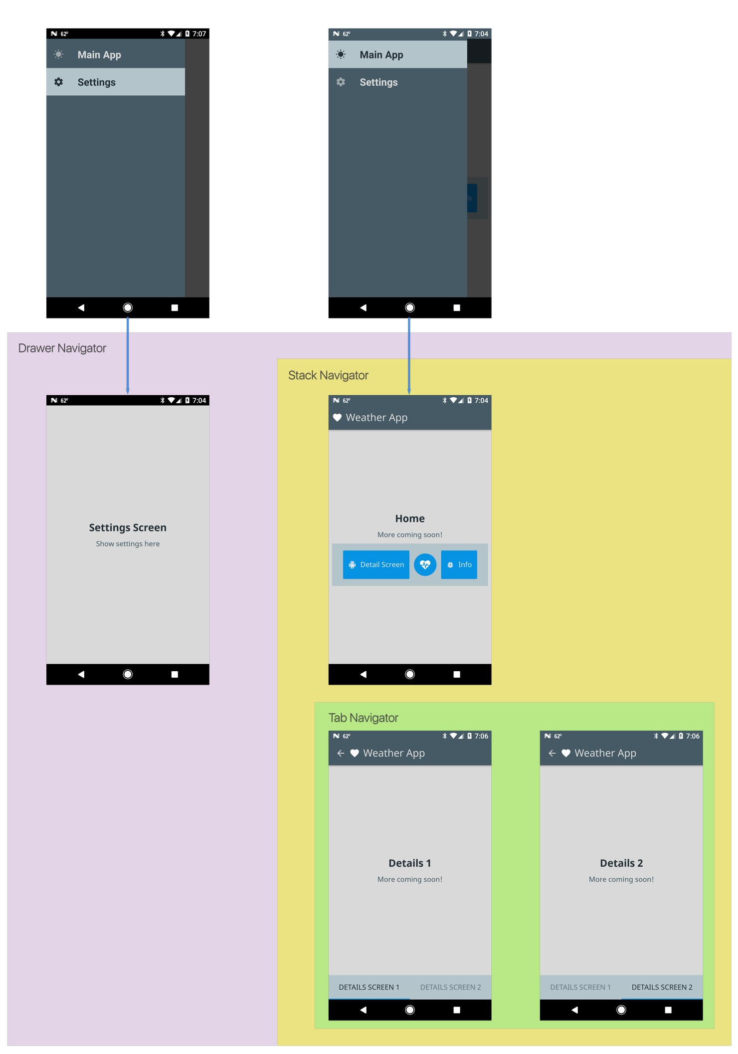
Our sample app is supposed to be a weather app with 4 screens. To keep things simple, I’ve left out what goes inside of these screens for this tutorial (that will come in another tutorial later with Firebase, SignIn and a whole host of other goodies). If you look at the diagram below you will see the navigation hierarchy that I’m creating in the app.
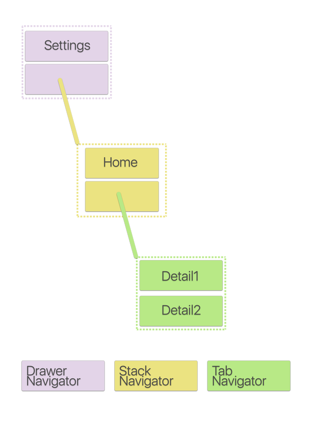
The user is started off with the Home screen, but they are free to go down one of two paths at any time.
Path 1 - They can start at the Home screen flow and then click on the Detail Screen button
and be taken down the path where they can switch between Details 1 screen and Details 2 screen1.
Path 2 - They can just go to the Settings screen where they can change whatever app settings.
In the real app, these screens will have real UI and data in them. Here is what they will have:
-
Homescreen will have a list of locations that are saved. -
Details 1screen will have current conditions and today’s forecast, for the location selected in the Home screen. -
Details 2screen will have the week’s forecast for the current location, for the location selected in the Home screen. -
Settingsscreen will allow the user to change the app’s settings.
The user should be allowed to go back and forth between the Settings screen and the
Home -> Details1 / Details2 flows at any time. And this can be achieved with a
Drawer Navigator.
The user should be able to switch between Details1 and Details2 screens at any time. And this
can be achieved with a Tab Navigator.
Finally, the user should be able to switch between Home screen and the Details1 / Details2
screens at any time. And this can be accomplished with a
Stack Navigator.
The following diagram shows these flows along with the app’s current UI.
Implementation #
The app folder in the source code has all the files for the UI and navigation code.
The main class to start with is the
Router.js
class. This makes a call to AppRegistry.registerComponent() so that the UI will be loaded.
AppRegistry.registerComponent("WeatherApp", () => nav_drawer)
What is nav_drawer? It’s a Navigation Drawer. If you look at the diagram above the colored
rectangles in the background correspond directly to the Navigator objects that are created. And
there is a direct mapping between the navigation hierarchy and the code, which is the beauty of
using React Navigation. It’s incredibly powerful and elegant and simple to use.
If you’re not familiar with React Native navigators, please
check out my tutorial on getting started with React Native
where I talk about routes, and using the navigation object to push and pop routes. Just like
OG Navigator, you have to
define all the Routes in your application. So regardless of what type of navigator you are using
(drawer, tab, or stack) you will have to construct it with a set of routes. Each route has a name
and it loads a screen. Here’s an example using TabNavigator. And just like the OG Navigator you get
a navigation object that you can use to push, and pop different routes. It’s called
props.navigation. The Button code
snippet at the very top of this tutorial uses this.
Please read the Navigation Actions documentation on the React Navigation site to get a clearer idea of how to pass data between routes. There’s even information on Redux integration. In future tutorials I will go even deeper into navigation, and add Redux, and Firebase to the mix, along with external web services, so stay tuned for these.
//
// tabs
//

const nav_tab = TabNavigator(
  // route config
  {
    DetailsRoute1: { screen: DetailsScreen1 },
    DetailsRoute2: { screen: DetailsScreen2 },
  },
  // navigator config
  {
    lazyLoad: true, // render the tabs lazily
    tabBarPosition: "bottom", // where are the tabs shown
    backBehavior: "none", // back button doesn't take you to the initial tab
    tabBarOptions: css.tabs,
  }
)
Navigators can also take other navigators as screen values, they don’t have to be
React.Components, which is awesome. The 2nd parameter you can supply any of the navigators is a
config object to setup that navigator. This can be styling for the header of a StackNavigator or tab
styling for a TabNavigator.
The following is an example of a StackNavigator that takes a React.Component as the title of the header component. Instead of just showing text, this component shows an icon as well. This is all put together and assembled as a navigator config for the StackNavigator object.
//
// stack
//

const titleAndIcon = (
  <View style={css.header.container}>
    <Icon name="favorite" color="white" />
    <Text style={css.header.text}>Weather App</Text>
  </View>
)

const nav_stack = StackNavigator(
  // route config
  {
    HomeRoute: { screen: HomeScreen }, // this is displayed first
    DetailsRoute: { screen: nav_tab },
  },
  // navigator config
  {
    //headerMode: 'none', // this removes the navigation header
    navigationOptions: {
      // label text
      headerTitle: titleAndIcon,
      // other styling
      ...css.header,
    },
  }
)
Finally, here’s an example of a DrawerNavigator that accepts a custom component that paints the DrawerItems in a custom way (by using a ScrollView and setting a custom background color).
//
// drawer ... more info https://goo.gl/2Dnmtl
//

const customComponent = (props) => (
  <ScrollView
    style={{
      flex: 1,
      backgroundColor: css.drawer.style.backgroundColor,
    }}>
    <DrawerView.Items {...props} />
  </ScrollView>
);

const nav_drawer = DrawerNavigator(
  // route config
  {
    HomeRoute: {
      screen: nav_stack,
      navigationOptions: {
        drawerLabel: 'Main App',
        drawerIcon: ({tintColor}) => ,
      }
    },
    SettingsRoute: {
      screen: SettingsScreen,
      navigationOptions: {
        drawerLabel: 'Settings',
        drawerIcon: ({tintColor}) => ,
      }
    },
  },
  // navigator config
  {
    contentComponent: customComponent,
    drawerPosition: 'left',
    // styling for for DrawerView.Items in contentOptions
    contentOptions: css.drawer
  }
);
Note that a lot of the params that are needed are stored in a css object. This object is imported
from
Styles.js,
and it’s an attempt at encapsulating the look and feel away from the functionality of the
components.
Modeling in-app navigation by nesting navigators #
Once you have designed the flow by collaborating with your designers, you should have a clearly mapped out idea of what the navigation flow should be. This is a good time to then use the navigators to model these navigation flows. By nesting navigators in each other, you have incredible amounts of power and flexibility to do things that would otherwise take a lot of time and effort to do!
When you compare the new React Navigation framework to the OG Navigators, it’s incredible how much you can express with such little code. And the API surface is elegantly designed so that the way you use these navigators are really consistent.
Finally, when compared to native Android code, it’s hard to digest how much easier it is to use React Native with React Navigation when compared to coding up Java in Android. To do the TabNavigator you would need to do SO MUCH MORE work in Android! You have to use ViewPagers, and create a ViewPagerAdapter, and then create Fragments for each of the screens, and then you have to create XML layouts for each of these Fragments! You can look at the code in the MainActivity.java of the native Android + Redux tutorial I have on this site.
React Native resources #
-
This is a good resource that you can follow for keeping up to date with changes in RN – http://reactnative.cc/
-
This a great facebook community on React Native.
React, Redux, and native Android resources #
- How to integrate Redux into native Android development. I have tutorials on native Android and Redux here.
👀 Watch Rust 🦀 live coding videos on our YouTube Channel.
📦 Install our useful Rust command line apps usingcargo install r3bl-cmdr(they are from the r3bl-open-core project):
- 🐱
giti: run interactive git commands with confidence in your terminal- 🦜
edi: edit Markdown with style in your terminalgiti in action
edi in action