Flexbox layouts and lists with React Native
- Introduction
- What you will learn in this tutorial
- Get the project from GitHub
- Wireframe -> Flexbox layout -> code
- Data driven design
- React Native resources
- React, Redux, and native Android resources
Introduction #
This tutorial is all about using Flexbox layout in React Native. I will show you an in-depth example of taking a wireframe and extracting it into a set of React Native components and then styling them with Flexbox so that they match what was designed in the wireframe (in Sketch). I will also be covering the new FlatList in React Native, which is the preferred way to create lists.
I won’t be covering React Native basics, for that please refer to my Getting Started with React Native tutorial.
What you will learn in this tutorial #
You can learn more about the basics of Flexbox in this tutorial, and here on Mozilla Developer Network. In this tutorial, I will take you thru the process of dissecting a wireframe and turning into React Native components, and using styling to make the UI match the high fidelity mockups you might get from your design team.
I will also walk you thru the new FlatList component that is part of React Native. It’s a very powerful API and it’s very elegant and simple to use, yet, it’s very expressive and powerful - what’s not to like!
Get the project from GitHub #
We are going to use this fake weather app that I’ve created, along with the help of Maret Eiland - she’s a designer who can talk to developers :). You can download the source code and run the project on your local development environment.
- Here’s the link to the project on GitHub.
- You can download the Sketch wireframes here.
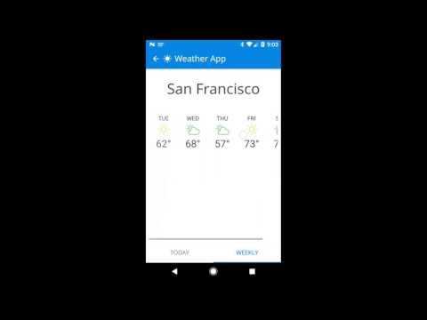
Here is a video of what the app looks like on Android:
Here’s a video of what the app looks like on iOS:

Wireframe -> Flexbox layout -> code #
Before we get started on the process, here are the 3 main screens of the weather app that we are using. You can find these screens in this Sketch file here.
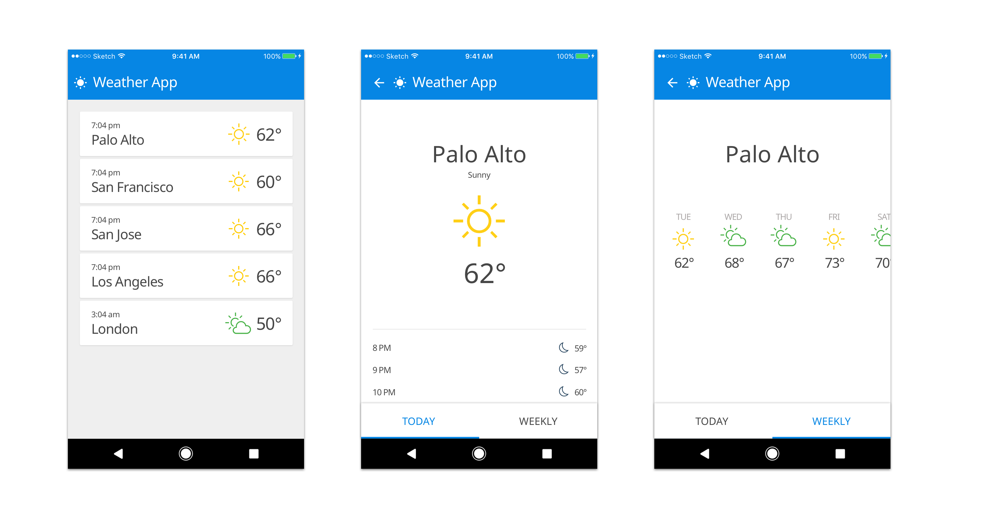
Each screen of this app contains a FlatList with a row renderer and some styling. I will take you thru the process of generating the first screen that shows a list of places with the current temperature and current conditions icon. Once you see how the first screen is created, the other two screens are very simple to create.
Going from wireframe to Flexbox #
The wireframes from Sketch contain a picture of the desired UI. This is what your design team might hand you. The task of converting this picture into React components with styling is our challenge. The best way to think about this is to:
-
Start cutting your wireframe into boxes that map to React components.
-
Think about how these components are composed. They are probably going to be nested somehow. There are going to be parent components (containers) which will contain children components. These children might also be containers for other components in this hierarchy.
Let’s use a real example of the Home screen of our app. It has a header (icon and Weather app) that is provided by the Stack Navigator. So we can ignore this. We are most interested in the list view that contains places and current temperature information. This list view is going to be built using a FlatList, since this is the new and better way of doing things.
The way FlatList works is that it takes some data, and it takes a row renderer which will handle the
task of rendering or painting each row to the screen. FlatList also takes care of it’s own
scrolling, and you can even set the layout direction (horizontal or vertical). Additionally,
flex:1 is set on the FlatList by default and you can’t really change that.
Going from FlexBox to code #
If you look at the diagram below, it visually depicts how we break the Home screen into a FlatList, then apply styling to the FlatList and then map that into React components that we add to our JSX.
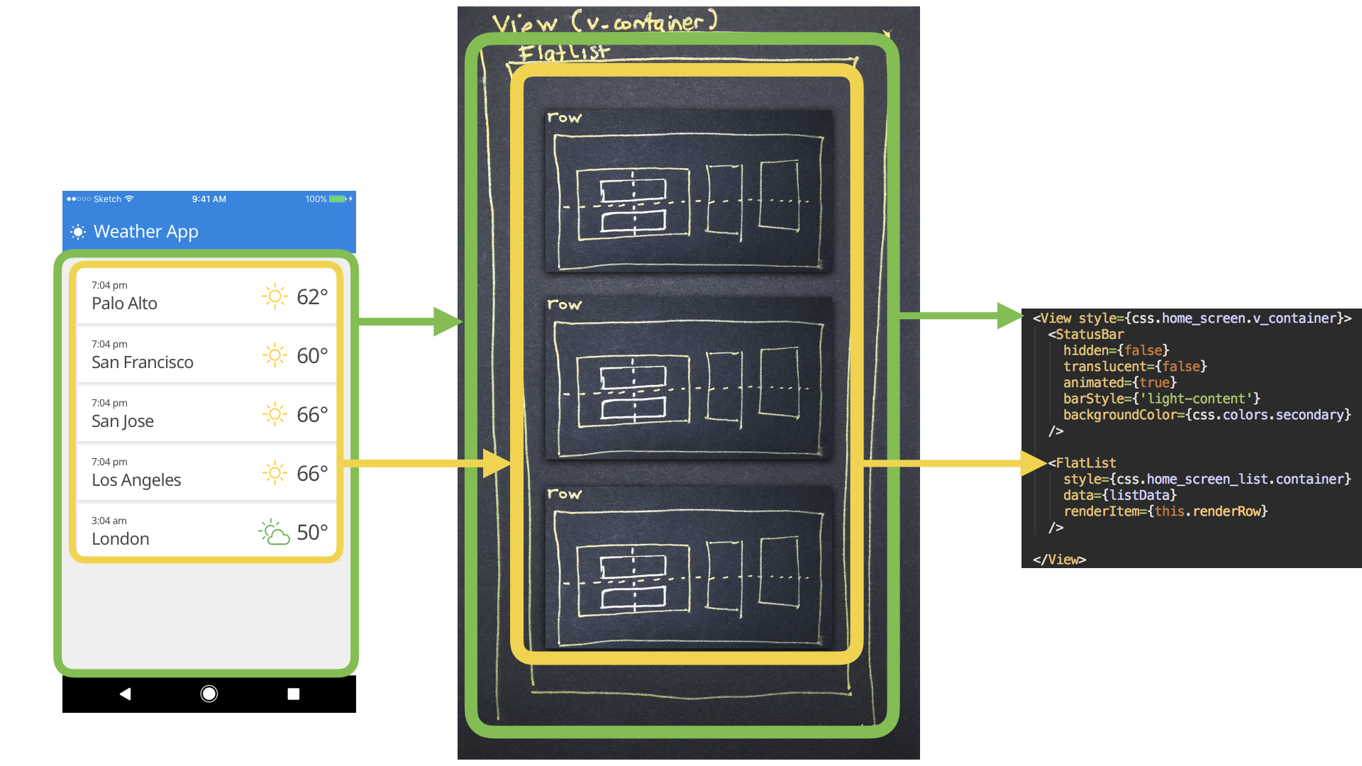
This is the code for the JSX you see on the right of the image:
<View style="{css.home_screen.v_container}">
  <StatusBar />

  <FlatList
    style="{css.home_screen_list.container}"
    data="{listData}"
    renderItem="{this.renderRow}"
  />
</View>
Here are more details on the styling (from Styles.js): #
There’s a v_container style that’s set for a View, which acts as the main container for the entire
screen. It sets the background color to a light gray color and sets up the flex box container and
main axis and cross axis alignment options.
export const home_screen = StyleSheet.create({
  v_container: {
    flex: 1,
    padding: 8,
    flexDirection: "column", // main axis
    justifyContent: "center", // main axis
    alignItems: "center", // cross axis
    backgroundColor: colors.background_dark,
  },
})
Here are more details on the JSX (from HomeScreen.js): #
Inside of the View we have a StatusBar component for Android (ignore this for now). The main thing
inside of this View is the FlatList component. This component is created with:
- The dummy data (more in this later in this tutorial).
- The style for the
FlatListitself. - The
renderItemfunction that will be used to render each row of the data.
Here’s the styling for the FlatList:
container: {
  marginTop: 14,
  alignSelf: "stretch",
}
The renderRow function #
The heavy lifting of doing React component composition with Flexbox really happens in the
renderRow function which we will deep dive into now.
renderRow({item}) { const time = `${item.time}`; const place = `${item.place}`; const temp =
css.addDegreesToEnd(item.currentTemp); const {iconName, iconFont, iconColor} = item.icon; let
actualRowComponent =
<View style="{css.home_screen_list.row}">
  <View style="{css.home_screen_list.row_cell_timeplace}">
    <Text style="{css.home_screen_list.row_time}">{time}</Text>
    <Text style="{css.home_screen_list.row_place}">{place}</Text>
  </View>
  <Icon
    color="{iconColor}"
    size="{css.values.small_icon_size}"
    name="{iconName}"
    type="{iconFont}"
  />
  <Text style="{css.home_screen_list.row_cell_temp}">{temp}</Text> </View
>; ... }
Here’s the styling code that goes along with this code.
export const home_screen_list = StyleSheet.create({
  container: {
    marginTop: 14,
    alignSelf: "stretch",
  },
  row: {
    elevation: 1,
    borderRadius: 2,
    backgroundColor: colors.tertiary,
    flex: 1,
    flexDirection: "row", // main axis
    justifyContent: "flex-start", // main axis
    alignItems: "center", // cross axis
    paddingTop: 10,
    paddingBottom: 10,
    paddingLeft: 18,
    paddingRight: 16,
    marginLeft: 14,
    marginRight: 14,
    marginTop: 0,
    marginBottom: 6,
  },
  row_cell_timeplace: {
    flex: 1,
    flexDirection: "column",
  },
  row_cell_temp: {
    color: colors.weather_text_color,
    paddingLeft: 16,
    flex: 0,
    fontSize: values.font_temp_size,
    fontFamily: values.font_body,
  },
  row_time: {
    color: colors.weather_text_color,
    textAlignVertical: "bottom",
    includeFontPadding: false,
    flex: 0,
    fontSize: values.font_time_size,
    fontFamily: values.font_body,
  },
  row_place: {
    color: colors.weather_text_color,
    textAlignVertical: "top",
    includeFontPadding: false,
    flex: 0,
    fontSize: values.font_place_size,
    fontFamily: values.font_body,
  },
})
The following diagram shows what is happening in this renderRow function.
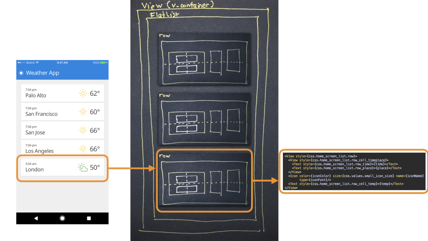
Here are the steps that have to happen going from the picture of a row in the wireframe (on the left) to the code on the right:
-
Each row of the
FlatListis comprised of some data that has to be displayed. We extract this data from the{item}JSON object that’s passed to therenderRowfunction from theFlatList. From this{item}object, we get thetime,place,currentTemperature, andicon. The values from these objects are then used in the React components nested in the JSX code. -
There’s a container View that is styled with the
home_screen_list.rowstyle. This basically creates a horizontal container which will hold all the other components inside of it. There are 3 React components that are nested inside of this container:-
Viewthat holds the 2Textcomponents that display the time and place info, that are stacked vertically. Thehome_screen_list_row_cell_timeplacesets this container up.flex:1is set on this container, and it takes up all the horizontal space that’s available, so that the icon and temperatureTextcomponents can be slammed to the right of the row. This creates the space that you see in the UI.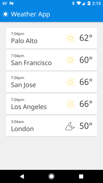
-
Iconthat displays the font icon. Noflexvalue is set for this component, so it takes up its preferred height and width. -
Textthat displays the temperature value with stylinghome_screen_list.row_cell_temp.flex:0value is set for this component, so it takes up its preferred height and width.
-
-
The
FlatListthem stamps out each row of the data that’s provided to it, and renders the UI that you see in the app forHomeScreen.js. -
In the code, there’s some platform specific code that uses a
TouchableHighlighton iOS orTouchableNativeFeedbackon Android to wrap each list row. When a user touches each list row, it uses the_navigationobject in order to push the appropriate route into the Navigator.
Best practices for collaborating with your design team #
Whew! That has been a deep dive into how to go from wireframes -> flexbox -> code in React Native. You can engage your design team in this process as well, since they can provide you with:
-
Feedback on how to actually create the styles (what values to set for padding, margin, size of the icons, colors, and so forth).
-
Organize the layouts in your code using Flexbox. Since they constructed the wireframes, they have a vision in their minds of how the UI should actually function. Currently they give developers a picture of a thing, and not the actual thing. Developers are then responsible for taking the picture and making the thing. And lots falls apart in this collaboration today.
It is also important for your design team to understand the basics of Flexbox so that they can understand how to structure their thinking when assembling the wireframes themselves. All too often, designs get ‘shipped’ from design to development and there isn’t a good way for designers to communicate with developers, so that their designs can come to life in the way that was intended by them.
Data driven design #
Our fake weather app is fake because it actually doesn’t hook into a live data source for it’s information. However, the app is constructed in a way that it should be possible to swap out this fake data pipeline for a real one (that’s coming from a web service). I’m going to release a tutorial very soon with this app using real weather data, Firebase, and even social SignIn, so please stay tuned for that.
The fake data in our app comes from
Data.js.
This is a JSON object that holds an array of objects for the FlatList component. Each item in this
array is an object that holds information about a place:
- place name,
- time,
- icon,
- current temperature,
- description,
- an array of objects holding today’s forecast (called
dailyForecast), - an array of objects holding this week’s forecast (called
weeklyForecast).
I showed you in depth how the HomeScreen.js is built, and how it leverages a FlatList to render
this list of data. When the user clicks on a row in the list, React Navigation is used
(Router.js)
in order to push the user selection of place, and then provide views that
display today’s forecast,
and the
week’s forecast.
Working with data in this manner to prototype the app’s UI and interaction is really good practice, and I recommend it strongly. I even recommend that you engage with your designers and get them to start with data as well, and consult with development teams to determine if certain types of data can be accessed by your app.
React Native resources #
- This is a good resource that you can follow for keeping up to date with changes in React Native – http://reactnative.cc/
- This a great facebook community on React Native.
React, Redux, and native Android resources #
- How to integrate Redux into native Android development. I have tutorials on native Android and Redux here.
👀 Watch Rust 🦀 live coding videos on our YouTube Channel.
📦 Install our useful Rust command line apps usingcargo install r3bl-cmdr(they are from the r3bl-open-core project):
- 🐱
giti: run interactive git commands with confidence in your terminal- 🦜
edi: edit Markdown with style in your terminalgiti in action
edi in action